Location sketching – Cronulla NSW
January 19, 2019


The main street of Cronulla NSW long ago changed into a mall but is still redolent of cars and trucks from my childhood memories. Sitting here, I get flashbacks of how things used to be.
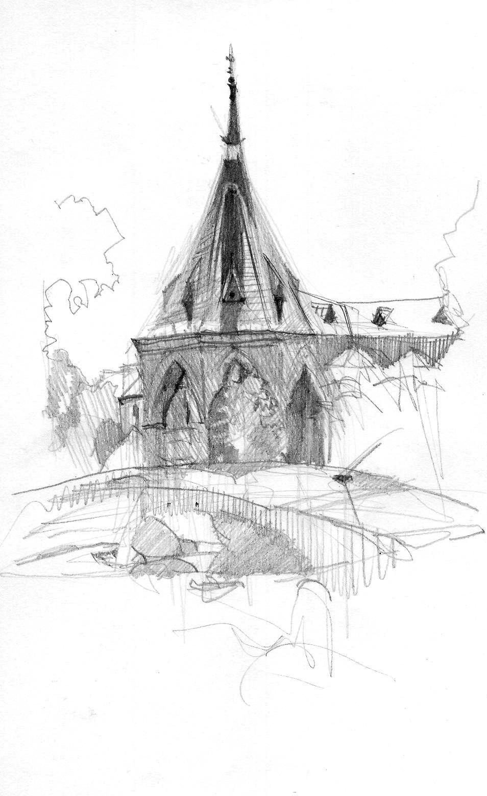
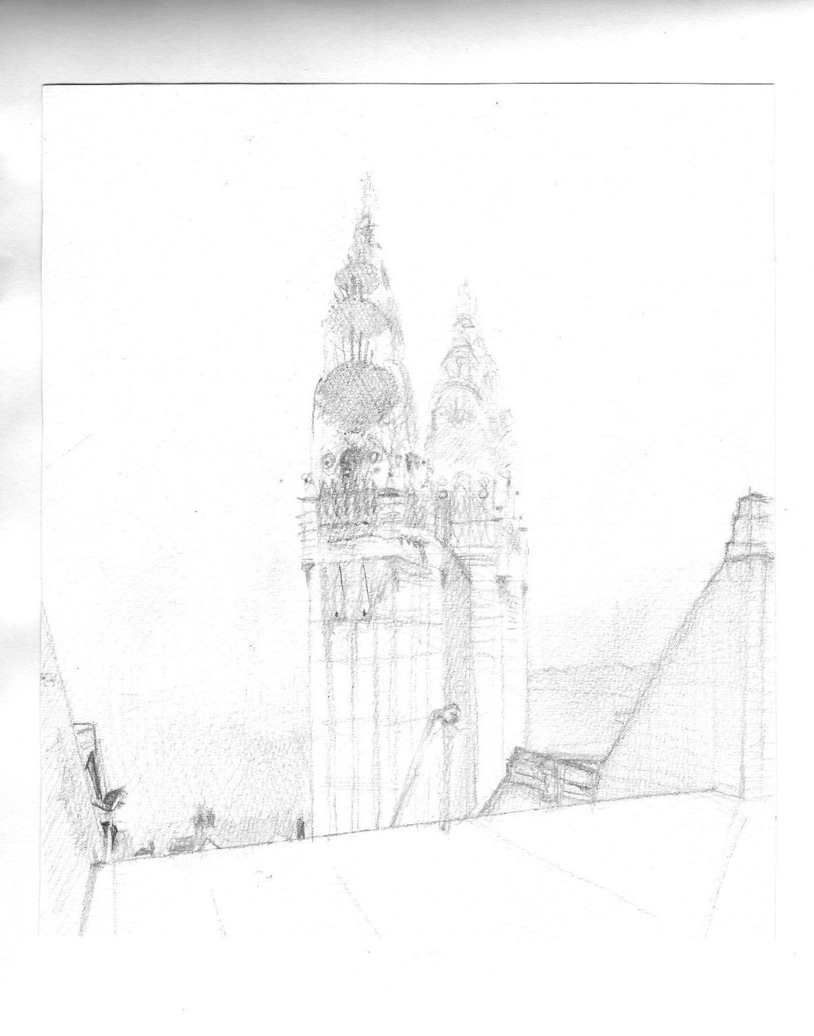
Other sketchers in today’s group concentrated on a clocktower in the middle of the mall, flanked by white stall marquees, creating a strong single-point perspective design. As an alternative, I checked out the relatively few architectural monuments along this narrow street; getting an interesting vantage point was not easy, the oldest buldings having been repurposed and having lost a lot of their glorious past as free-standing buildings.
I chose less obvious subject matter, a “side view” of the mall, with no central focus. There is a lot of “mess”, a lot of people and a lot of noise. Not exactly sure of what I would find – if indeed I would “find” anything – I did my usual thing and started with a hard H pencil to create some sort of framework. This dragged out for forty minutes with nothing coming to the surface. At one point, an inquisitive stranger stopped to ask me if I had my vanishing point and orthogonal lines in place.
I got talking with two other sketchers at this point and we discussed things like tone and direction lines and pentimenti. Pentimenti was raised in the context of pace: slow sketching focussing on realistic, naturalistic representation or looser, more expressionistic sketching to portray mood and emotion. We talked also about developing a signature style, one that is subsconciously unique to us and immediately recognisable to others.
We had a go at quick continuous line drawing, a chance for me to play with quill feather and ink, fineliner and yellow highlighter. The idea behind this is to familiarise ourselves with a wide range of the object’s qualities before we settle on one aspect or one feature. Ordinarily eight three-minute sketches of an object in different positions is a useful way to spend half an hour.
This resulted in we three sketching for ten minutes the same subject: a tonal sketch of two other sketchers in the distance and another of a bright white umbrella.
My drawing of the people was small, almost sight-size, with an emphasis on tone and shapes.
We discussed approaching a sketch of the umbrella, I positing that the architecture of the umbrella was primary (focussing on the pole!). Because the horizontal triangle was so difficult in its own right, my sketch concentrated on creating the white as a negative space: I worked on the spatial geometry of the windows and background to create the white for me.
Daily Drawing – Westconnex 6feb18
February 6, 2018
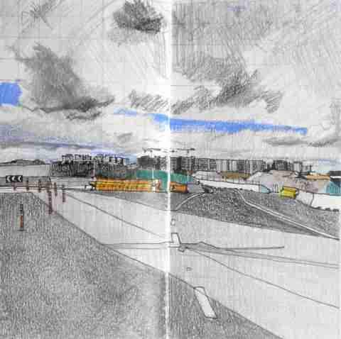
Mascot panorama, 8″ square, Venezia Sketchbook Fabriano Accademia 200gsm; Sakura micron 0.5mm fineliner; Polychromos oil-based coloured pencils.
Over the years, I’ve been threatened while out location drawing at building sites into discontinuing a sketch by security guards and building/construction personnel, despite always working on public property. The law is on my side, but it’s not worth sketching under the bullying gaze and verbal interrogation of others.
The Westconnex expressway development has seen public protests since its inception so, along with the oppressively hot and humid weather today, I wasn’t going to mix it with the construction workers. Even taking a couple of reference photos for potential drawings was done as unobtrusively as possible.
I was surprised to accidentally come across this panorama of the burgeoning apartment blocks around the new metro station of Mascot in the distance. I remember when Mascot property was light industrial, with the smell of horse knackery by night. Nowadays haute couture boutique shops and luxury car showrooms have taken their place.
Apart from exploiting natural direction lines, this is a routinely-challenging square format. Making it into a rectangle would eliminate the white road markings as well as the dramatic sky. And yes, I realise it’s a cliche-looking Jeffrey Smart composition. I need to spend more time ‘skying’, as John Constable called it – drawing skies and clouds.
Use of coloured pencil with waterproof pen (as championed by James Richards, for example) is a natural extension on my pen-alone work yesterday. I love the way that in Richards’ drawings, the coloured pencil calms the overly-strong black-and-white penwork and how his very sketchy use of pencil, rather than block areas of colour, works like tinting an engraving.
Daily Drawing – 90mins 5feb18
February 5, 2018

Sakura Micron 0.5mm fineliner on A2 cartridge
The Rocks, Sydney
Working alla prima with no pencil underlay and with no forethought about geometrical foundation, I worked from right to left initially in contour, then in a combination of tone and cross-hatching. The line wasn’t as fluid or loose as I’d anticipated and I’m re-learning a lot about the subtlety of cross-hatching. I’m surprised how little my penwork has changed over the last five years: the ‘signature’ is firmly in place.
Happily, I worked under shelter and with a ‘found’ easel and in a setting almost devoid of distractions. High up on the viewing platform on the Cahill Expressway overlooking Circular Quay, I had barely a handful of visitors – best of all was not having to hold or handle the paper while working. Sydney Sketch Club worked this venue recently and visited the doomed Sirius building (left) from the Brutalist era. Not conveyed here with any deftness are the striking contrasts in architecture: from the Australia Navigation Company building far right, to the modernist hotel centre and the new Museum of Contemporary Art annexe left. The shadows got more defined in the last hour of the drawing, 10.30-11.30am, though their geometrical shapes were more interesting in the half-hour before that. I liked adding the indigenous flag far left.
I hope to return to this location soon.

Location Drawing – Sylvania NSW 2224
January 13, 2018

Today I went out sketching with a very genial location drawing group at the southern end of Tom Ugly’s Bridge, Sylvania, facing north on to the Georges River. Though it was hot (33/mid-80s) it was overcast and not yet sunny, so the river had a distinct grey-green look about it.
This started out with a Rule of Thirds in place, the LH third corresponding to one of the bridge pylons and the other to the edge of the boat ramp. These measurements got distorted over time, since I ended up going further ‘south’ than originally intended. I knew it had to be reasonably high key because of the strong sunlight but there was no way I was going to flood the drawing with watercolour washes.
The paper is not watercolour since it’s a Hahnemuhle Sketchbook, hence the rather strange ‘granulation’ of the Daniel Smith watercolour washes.
The kraft paper frame overlaid on top is a temporary measure. I’m sure that if this became a painting it would go through some tough re-negotiation in terms of Rule of Thirds and Fibonacci spiral measurements. That may or may not happen, though reworking the rocks would be very worthwhile for me.
This 9×6″ sketch filled a page of my Venezia Sketchbook Fabriano Accademia 200gsm and the pencil was a breeze compared to recent watercolour struggles I’ve had this past week. I worked this with Mitsuhishi 4H (layin)), 2B (detail) and 4B (dark highlights) only. I had in mind the effect of a Lionel Lindsey woodblock print.
There was on hand an infinite range of subject matter to work on: boats on ramps, barges on the water, seagulls, swathes of sand, fishermen, let alone light effects on water. It’s easy to feel overwhelmed by the ‘largeness’ of everything and by narrowing the focus, one feels one is missing out on so much more!
Gunnamatta Park NSW 2230 – location drawing
January 6, 2018

Here’s the view I chose for the sketch. It was 30 degrees, very bright sun with a cooling northerly breeze; this looks west over the bay and I was attracted by three things:
- the dynamic angles of the old trees (background left);
- the way the colours changed on the water (from dry sand to wet sand to shallow water to deep water);
- the strong, dark shadows associated with bright summer days. These shadows are so much more inspiring to draw than the muddy greys associated with more overcast weather.

Here’s the view as I wanted it on my page – double-spread in a Venezia sketchbook, Fabriano 200gsm, 9×5″.
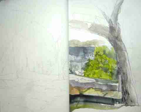
Here’s the sketch I walked away with. After an initial lay-in in 4H Staedtler pencil, I took up my small dagger brush with watercolour.
I got down on paper none of the things that attracted me to the scene in the first place. My only consolation prize was some revision of geometric shapes in vegetation. I tried to salvage the heavy-handed watercolour brushwork with some 6B pencil in the tree (right), by way of contrast, but destroyed most of that contrast by adding a wash of Derivan Liquid Pencil (what I colour “black-and-white watercolour”).
I’ll revisit this subject with some Golden Mean/Fibonacci spiral geometrical foundations and, using the photos, attempt something much simpler. I am very keen to revisit the old trees near Gunnamatta Bay and study further the gradations of colour associated with the surprising range of colour in the water.
I definitely need to revise my timed (20-minute) plein air watercolour drawing.
This particular spot was enlivened by the Polynesian beachgoers nearby.
I thoroughly enjoyed the company and inspiring work of colleagues from Shire Sketchers! We encountered similar problems and challenges with the subject matter and I hope to work with them again soon.
Plein air drawing 1jan18
January 1, 2018

Detail. Royal Botanic Gardens, Sydney. Fabriano 200gsm, Mitsubishi Pencils, Derivan Liquid Pencil Grey #9. 11am, 50mins, 1jan18.
Crisp cast shadows on a bright sunny morning, this is a detail from a double-page spread (Venezia Sketchbook, 6×9″) where I was aiming for contrast between the bizarre marble fountain and the surrounding Australian trees. The neighbouring palm trees are sinuous and elegant and I’ve always liked the built environment backdrop associated with most views looking west from the park.
I need to simply the forms of course and it’s worth revisiting in terms of detailing the backdrop of trees and building.


Partially cropped. Royal Botanic Gardens, Sydney. Fabriano 200gsm, Mitsubishi pencils, Derivan Liquid Pencil Grey #9, Albrecht Durer colored pencils. 12.20pm, 40mins.
I was drawn to the lighting hire gear scattered here and there from the private New Year’s Eve function held in the gardens. There is a Manet reference in the reclining figure at left, as I wandered in a whimsical fashion to the left, including trees and skyscrapers as I went – there is little overarching unity here: perspective gets confused and the pencil drifts from one intriguing detail to another. There was a very loud rock concert going on in the Domain next door which I found disconcerting, given the tranquillity of the scene.
Location sketching #2: Circular Quay
December 27, 2014
I added to my collection of loose A4 photocopy paper sketches, figurative, anatomy, urban environment, with six pages done at a gathering of the Urban Sketchers Sydney group on the occasion of several overseas visitors, from the UK and Singapore. The location was the Museum of Contemporary Art on Circular Quay, overlooking the Sydney Opera House and Harbour Bridge.
I arrived twenty minutes early and that gave me a chance to do a closeup of the new MCA extension to the original 1952 building. I want to return sometime to differentiate between the blacks and whites of the facade.
As a group, we sat for three hours in the Museum cafe, out of the sun, by turns talking and sketching. This was one of those sessions when everyone is seated together, eating and drinking, when sketching becomes a secondary priority. Sketching food and drink as a meditation on transubstantiation or on contemporary consumerism is fine by me, but normally I’d be on the move looking for more interesting compositions; today was a matter of drawing everything directly in line of sight, regardless – a new page every thirty minutes.
The heads and figures are a result of privately mulling over issues raised recently by artists whose work I am inwardly digesting: Stan Prokopenko’s work on heads and figures and Marshall Vandruff’s expertise in perspective. I wrestled with the enormous gulf between working indoors with reference photos and squirming, agitated people in real life, obscured by furniture. Trying desperately not to be noticed was also difficult. I come away from this sort of session wanting to do more draped figure work.
In my rushing out of the house to arrive on time, I forgot my camera, sunscreen, eraser and Exacto knife. And I was the only one without an elaborate Moleskine full of exuberant watercolours. I wanted to do some work in gouache today on Smooth Arches 185gsm watercolor paper, but that would have required much more interesting subject matter.
Two pages scored a Chinese chop, in honour of our Singaporean visitor.


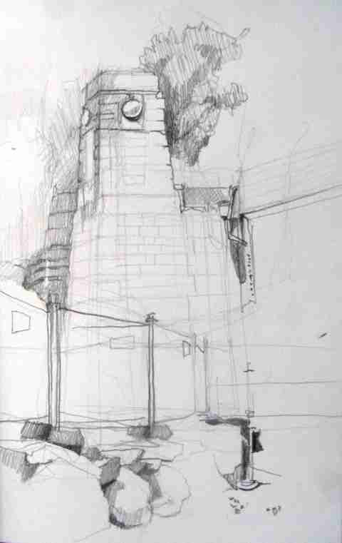
Location sketching #1: Regent Street Station (Sydney Mortuary Station)
December 21, 2014

Location sketching and plein air painting is something I’m trying to keep on the back-burner at the moment. Summer weather can be difficult, but I’m trying to take advantage of social sketching opportunities as they arise.
This building is one I’ve had my eye on for a while, even though it’s closed to the public. There’s a lot of “guessing” involved because it’s hidden behind a lot of vegetation.
Often with a particular architectural destination in mind, I try to do my research online beforehand. There are so many pics taken by amateur photographs (90% of the time they will match where a potential sketcher will sit) and historic photographs (often taken just after the building’s completion and before any landscaping has gone in). Having pre-visualised the location takes off that initial layer of wondering what location to pick and the time and effort in sizing up the architecture and streetscape.
Alas, I spent three hours merely coming to grips with the building’s structure instead and the first sketch here was done in the last twenty minutes. I was sitting next to a building site entrance with a lot of trucks coming and going – the truck drivers were not happy about someone sitting so close to ‘their’ kerb. You’ll note the heavy shadows – it probably looks a lot better in the afternoon when the facade is hit by the western sun. For the record, the three sketches below were the warm-ups.
I really came along today to capture the gesture of the building, its main volumes or “blocks”. I want to return to take in its Venetian Gothic characteristics, a style I’m not familiar with. What I particularly enjoyed about the morning was the intricate geometrical shapes of the interior – the stand-alone sandstone Ticket Office under the vaulted ceiling of the main tower.
These were done on A4 photocopy paper in graphite 3H, with detailed picked out in 4B. Everything I’m doing during the current 10-week summer break from Art School is being done on loose A4 photocopy paper, which I’ll later hand-bind into a ‘vacation sketchbook’ of sorts. It’ll be submitted for student assessment, as secondary material done outside class, on 19 June 2015.
My next post will be about its 13th-century Venetian Gothic features in more detail.


Alphabetical Sydney
November 29, 2013
In time for Christmas, a children’s abcedary which deals in the main with aspects of everyday life (e.g. C for Cicadas, S for Sunburn) rather than Sydney landmarks or architectural icons.
The illustrations link small amounts of freehand drawing and watercolor to large amounts of clever photomontage.

Pesenti, Antonio and Hilary Bell, Alphabetical Sydney. Sydney: NewSouth Publishing, Univ. of NSW, 2013.
Working on perspective: Sydney Harbour #2
November 18, 2013
In response to the challenge of sketching the Sydney Harbour Bridge, I decided to square up an historic black-and-white photo taken in 1932 and transfer it to my sketchbook. I see this sort of activity as a form of subconscious “mind training”: I’m conditioning my visual memory so that when I draw it in the flesh, on site, on location, spatial relationships might come more easily. Plainly a lot of detail simply wasn’t visible in a photo taken at night, so I just drew what I could discern from the floodlit Bridge and nothing more.

I turned up at a North Sydney USk Sydney event with no agenda in mind. I took the opportunity to wander down to Bradfield Park having seen the Arthur Streeton painting of Circular Quay where he stood as close as he could to the water of the harbour. With the night photo drawing and Grace Cossington Smith’s views of the eastern side of the Bridge in mind, I found a vantage point off a footpath. Because of bushfire backburning, the Harbour was full of Sickert-like fog, only really suitable for black-and-white. The end result seemed to have been that I was channelling Norman Lindsay – he would have sketched it in an almost identical way.

To the immediate right of the iconic Luna Park entrance is a very steep staircase and the next two sketches use it: the first looking down and the second looking up. I would have liked to launch myself into some color work, but I seemed to have all sorts of problems getting the measurements and proportions right. I worked on the ground plane first but veered so far off course from the original Albertian veil measurements, that I had to improvise. The first photo shows the full page of the sketchbook, the second shows what I wanted to edit in terms of the Albertian veil. Apparently while I was sketching, a massive cloud of smoke blewn in and obscured the entire area, left of the tower. I need to return sometime to see what I was missing.
Not conveyed here were the glorious greys inside the stucco of the scallops. I would have liked to have captured that, but the 240gsm Fabbriano Academmia paper was a bit too rough for that.
Today’s key lesson was how important it is to stick with the content inside the Albertian veil or frame. Once I go outside the frame, I run the very real risk of downgrading or watering down the impact of the subject matter inside the frame. The visual impact will probably become diluted.

Undeterred and determined to return sometime to do the color some justice, I took in the foreshortened view of the staircase with the modern building behind. As usual, I’d bitten off more than I could chew, but persisted nevertheless. I liked the contrast between the 1935 Art Deco brick staircase and the contemporary high rise behind. It seems to epitomise Sydney.


The last sketch of the day was the Sydney Opera House. Interestingly it went from shades of grey (1pm) to warm up with some yellow after an hour or so (2pm). What attracted to me the building was not the large sails but how the smaller sails nestled or dovetailed into the larger ones – I liked that sequence. Architect Utzon liked the idea of the Opera House floating on the harbour, given its position on a peninsular. Particularly valuable was working beside a colleague and comparing what we both saw and how we interpreted exactly what each of us saw – in entirely different ways, of course!
Coincidentally it’s the 40th anniversary of the completion of the Sydney Opera House. I can say I’ve grown up with the building – here’s a photo I took in 1967 from the observation deck. I can’t recall the deck exactly, but it must have been a temporary construction in the Royal Botanic Gardens. The anniversary has rekindled emotions about the building’s original vision and its implementation; the stifling of creativity by Tory governments seems to be a never-ending refrain in Australia.

