Daily Drawing (timed 20mins) 26jan18
January 25, 2018
Why Daily? Regularly working the drawing “muscle”; exercises (identical to a gym workout) in eye-hand coordination, seeing shadow shapes and really ‘looking’ at reality instead of drawing what I symbolise in my mind.
Why timed? Working quickly is a necessity in plein air painting and location drawing because of shifts in light. In addition, anything more than 20mins will result in overworking – as in watercolour drawing.
Why these materials? Coloured pencils resist any lay-ins: one has to work alla prima. I leave careful composition and light pencil backgrounds to other media. A very light hard pencil, such as any in the H range, will leave lines which will show through the white drawing pencil. Working either black over white or white over black will result in a muddy, oily grey.
Why a series of themed drawings every day for a week? I’m trying to draw things I’ve never tackled before and I’m trying to move around a range of materials. I’m not one of these people who work a single subject in a single medium.
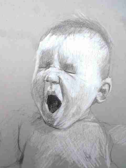
Why babies? I’ve never drawn them before, either from life or photos. One thing I am aiming for is the subtle difference between crying and yawning. I haven’t tested it, but I’m assuming there is a relaxation in the facial muscles involved in yawning that is not present in a cry. Of course, this is new iconography: you’ll never see a yawning baby in Medieval or Renaissance art when depicting babies was much more popular and routine than anything today. There is a personal precedent too: a while back I did some self-portraits on canvas paper with mouth open in charcoal overlaid with gesso, based on photographic self-portraits done in a formal studio concentrating on lighting setups.
Why black-and-white? If I can get these right in b&w, then I can progress to colour. I’m somewhat obsessed with Charles Reid’s use of watercolour in his figurative watercolours and I’m also fascinated by the granulation of Daniel Smith Potters Pink watercolour paint.
Today’s reference photo was a challenge because everything was in high key. There being so few darks – virtually none except the mouth – I had to go (very) easy with the Ivory Black pencil. There is a smudge over the ear, which worked well, but I’m aware that a much longer-timed drawing would involve much more finnicky smudging.
I’m disappointed I still haven’t got the proportions as could as they would be if there was a careful lay-in foundation, but that’s the price one pays for working alla prima with these challenging materials. And that was despite that today 90% of the time I copied the reference photo upside down.
Today’s photo included shoulders and chest, which poses additional difficulties outside the brief of this week’s sketches.
I am getting used to working from light to dark. If the very full, initial “lay-in” with white pencil only works, then I can work with pressing more heavily for the white highlights before picking up the black pencil.
Strathmore Toned Paper Gray 9×12″; Derwent Drawing Pencils, Ivory Black and Chinese White.
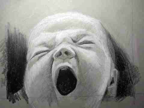
Daily Drawing (timed 20mins) 24jan18
January 24, 2018

It’s necessary with this medium to work from light to dark and to keep the areas distinct from each other. It’s quite tricky to keep Chinese White away from Ivory Black – otherwise, an oily grey (see lower left cheek) arises. The head is still too elongated and can be generally more rounded. There will always be a certain roughness, arising from the texture of the paper, and too-strong tonal contrast arising from just a single black and a single white, but otherwise it’s good practice in getting to know the strengths and weaknesses of materials.
By the end of this week’s Yawning Babies, facial anatomy ought to have improved somewhat.
Pencil on toned paper – Derwent Drawing pencils on Strathmore Toned Gray paper.
Daily Drawing (timed 20mins) – 22jan18
January 22, 2018
This week’s morning drawings will be Yawning Babies. Colleagues in the ShireSketchers group are working on “Young” (as well as “Geriatric”) as themes lately, I promised some square-format drawings this week, in contrast to last week’s “Foliage” theme, so they could see more of my drawings in the end-of-week photo collage.
Taking a break from Botanicals to more familiar Figurative territory, I want to start out in black and white and perhaps move to colour, the main reason being is that I really need to get the proportions of baby’s heads correct as a secure and necessary foundation. Yes, babies’ heads can move around a bit, but already from today’s I can see I need to consult some textbooks!
I’m working on Strathmore Toned Gray paper (9×12″) with Derwent Drawng pencils (Ivory Black, Cool Grey, Chinese White), even though the Cool Grey is almost exactly the same tone as the paper itself.
My perspective today comes from Thomas Thorspecken: “…Photographers shoot a photo and immediately move on. … I might be dissatisfied as the sketch progresses because the sketch is never perfect. It is important to accept the flaws and keep moving forward… As long as it isn’t the worst sketch you have ever done, you need to accept it, share it, and move on.”
.Essential to the work of Medieval and Renaissance artists, I don’t think I’ve seen a baby painted since the days of Mary Cassat. Babies, frankly, have pretty much dropped out of the repertoire.
Figure Drawing Fundamentals: a progress report
December 16, 2014


Photocopy paper, graphite pencil HB and 4B. Individual pages showing Gesture, Robo Bean, Structure and Mannequinization, drawn along with the Proko videoclips.
Figure Drawing Fundamentals – http://proko.com
In recent weeks, I’ve done an initial viewing of the videoclips Parts 1-12 to get a general idea of Stan’s approach. Drawing along with the videos (more at less at speed, though sometimes with judicious use of the pause button!) has yielded more than fifty pages of sketches.
At life drawing sessions, I’m often working in very cramped conditions so I’ll use A4 photocopy paper for gestures, moving as soon as I can to A2. This use of A4 is frowned upon at art school but I try and compensate by always using an overhand grip. Where I can, I’ll do multiple gestures on a single sheet of A2 cartridge. Overlapping poses is a good compositional exercise, but I like to keep a blank area for gestures.
I’m particularly impressed by the images of the models in Proko, free of shadows and the need to “invent” stuff you can’t see.
I’m also particularly impressed with seeing exactly what can be put to paper in the timeframes available (30secs to 2mins and beyond) and how so much can be achieved with such economy of line. New Masters Academy is similarly enlightening, though their images of the sitter are much smaller.
Particularly illuminating have been the Critique sessions which reveal an enormous gulf between work covered in the videoclips and the underlying expectations of what constitutes mastery of the approach taken. The videoclips reveal what Proko sees; the Critique sessions reveal what Proko and Vandruff want to see.
I’m finding gesture a lot harder to get my head around than those aspects which build on gesture, as explained in the robo bean, structure and mannequinization videoclips. Work on the robo bean and structure tend to more easily inform understanding of gesture than the other way round. I got a lot out of Steve Huston’s insistence (over at New Masters Academy) that all art – visual, dance, music, literature – is based on Gesture and Structure.
I find I put pencil to paper a lot quicker than Stan. Stan stops and thinks before he makes a mark. I search for the form on the paper instead of in my head. Personally I tend towards the Vilppu/Huston style of “finding” the line and lots of pentimenti on the page, Giacometti-like; Proko visibly “thinks” before putting pencil to paper which means he’s spending more time looking at the model than scratching away on the paper. I can hear Stan’s voice in my head: “No more than five or ten lines!”
I feel a natural pause at the end of Proko’s Part 12 for two main reasons: (1) Part 13 and beyond really require an upgrade in drawing materials, and (2) we’re talking about a Finished Drawing approach with a single long pose. At the moment, I’m less interested in producing extended finished drawings and more interested in competent sketching at life drawing sessions, dominated by very short poses (20mins maximum).
I’d like to consolidate the Proko/Vandruff approach by not just re-watching Parts 1-12 but extending the ideas to include other formats:
- practise using my own reference photos (especially those which are full-length poses and in optimum lighting conditions);
- practise using Old/Modern Master drawings (especially where they are incomplete and need to be extended to include the full figure from imagination);
- drawing entirely from imagination;
- drawing from an Action Figure;
- drawing from public sculptures;
- reinterpreting own figure drawings from the past;
- reinterpreting own life drawings from the past.
This will prove to myself that I’ve learned something from Parts 1-12 and I can critique my own work by measuring it against the comments in the Critique videoclips.
There’s a certain amount of overlap going on at the moment. I’m working through Proko’s Anatomy of the Human Body for Artists and (largely through guesswork) adding anatomy to the poses in the Figure Drawing Fundamentals course. The Anatomy course has the advantage of being in real time so I can digest new ideas for a whole week, whereas Figure Drawing is a course from the past and feels much more self-paced. Also I’ve been consulting my copy of Riven Phoenix’ Structure of Man, but of course his work is more “static” than that of Proko. I’m aware of this dichotomy of static and action especially since animation schools in America insist in their entrance portfolios on examples of each, not that I’m intending to apply to enter an American animation school. I’m watching the Vilppu and Huston figure drawing videos over at New Masters Academy and in lieu of Proko’s images, I’m using the NMA Image Library. Proko’s images have little “interference” from dark shadow, whereas NMA’s revels in shadows – large shadow masses being a signature feature of Steve Huston’s work, for example.
Why am I doing this all now? Well, I’m in the middle of a summer break and the academic year starts up again in two months. And in first semester, I have to do a course entitled Working with the Human Form.
Proko Tracing #5
December 16, 2014

Day 5 and the last of the five tracings for this week from reference photos, as per proko.com.
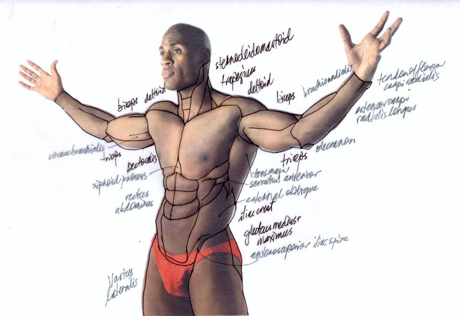
While the back is predominantly made up of the trapezius and latissimus dorsi, I’m becoming more familiar with the teres major below the scapula.
Next week’s course content from Proko will concentrate on the Latin terminology of anatomy and I’m keen to keep the momentum going with muscle anatomy by looking at Old Master drawings and paintings. At the same time, I will continue to make links with general figure drawing, no matter how tentative.
Proko Tracing #3 supplementary figure drawing practice
December 12, 2014

Graphite HB and 4B on A4 photocopy paper from a reference photo. Not so worried about wonky proportions, just keen on transcribing anatomical landmarks from the photo to my sketch. Happy to note both acromions as well as subtleties in the sternocleidomastoid, plus where light falls on the bony bits at the elbow and wrist. You’d think 64 pages of drawings, done in the last fortnight, based on Proko’s Figure Drawing Fundamentals Pars 1-6 would yield better results than this!
 Undeterred, I did a tracing on to tracing paper, marking key landmarks and muscles.
I’m trying to postpone my need to work on the skull and face till a later date.
Proko Tracing #4
December 12, 2014

Day 4 of Anatomy for Artists by proko.com, and Tracing #4, with focus on the torso under flexion, but widening to include anterior, lateral and posterior areas of arm muscles. My personal focus is moving to distinguishing the muscle groups in the arms, which I transcribed to a supplementary sketch from a reference photo. plus a tracing to improve the look of the proportions and gestural subtlety.
Differences between my freehand sketch and a tracing of the original photo include: the tilt in the head, a tilt in the shoulders, a tilt in the hips, elbows almost completely horizontal, imaginary plumb lines between acromions and elbows. More work to do!


Proko Tracing #3
December 8, 2014

 Day 3 and Tracing #3 from Anatomy for Artists by http://proko.com.
I’m testing what I think I already know with a “before” sketch and muscle names. Watching the Proko videoclip and coming up with an “after” sketch helps reinforce that and extend my knowledge that little bit further.
Today I’m thinking a bit more about the two heads of the sternocleidomastoids and the thyroid cartilages (obviously stronger forms in men). The abs and obliques are becoming easier. I’m starting to tune in a bit more to Prokopenko’s verbal cues about the origins and insertions of various muscles, something which will become clearer later on.
But two big weaknesses in my current level of understanding are painfully obvious: the direction of the extensor groups and the three areas of the pecs. Regarding the latter, I’m reminded of the famous da Vinci anatomical sketches in the Royal Collection which I need, even learning to draw them from memory!

Proko Tracing #2 supplementary figure drawing practice
December 8, 2014
A quick torso sketc h, supplementing the tracing #2 of Anatomy for Artists, proko.com, from a reference photo – graphite HB and 4B on A4 photocopy paper.
This is an exercise in anatomy informing my figure drawing – neither an expressive drawing, nor a mechanistic anatomical schematic. There’s a lot going on in the deltoid and triceps which I don’t yet fully understand – these two muscles are visibly under of a lot of flexion because the model is plainly pushing down on his hands.
I’ve adopted a strong contour technique in the area from the chin to the iliac crest, imitating the very strong contour of the likes of the Michelangelo frescoes.
I got a little carried away with the head, which is not the point of the exercise. And I really ought to have ‘stretched’ my figure drawing by blocking in the imagined whole of the figure but, hey, this is all about some new-found understandings of torso anatomy.
Proko Tracing #2
December 7, 2014
Day 2 and Tracing #2 from Proko’s Anatomy for Artists at http://proko.com.
I decided to do “before” and “after” sketches to define precisely what I know and is front-of-mind, what I know but have forgotten and what I now know what I never knew.
Done before watching the videoclip, the “before” short shows the muscle names I knew in black and I added, with a little help from one of the books by Civardi, some of the muscle names and landmarks I’d forgotten, in grey.
In the business world, we “know” according to what we measure (if it’s not being measured, it’s not getting done). In anatomy and figure drawing, unless I know the name of what I’m drawing, I’m probably drawing it incorrectly or vaguely. It’s the same with drawing buildings. Unless I know and see the architectural structure and stylistic features, then I’ll be haphazard. I may not wish to include all the architectural detail, but I have to convey to the viewer that I’ve seen it and know it’s there.
There are refinements in the draw-along “after” sketch, especially around the shoulders and interstices. I need to reinforce some of these refinements in my figure drawing. I’ve learned over the years that great artists “help” their viewers by “upping” certain anatomical features; I just need to do the same.
