Australian Wood Duck
May 1, 2020

Australian Wood Duck, 8×10″, watercolour/gouache/coloured pencil on mixed media sketchbook.
Day 1 of Every Day in May 2020, Sydney Sketchclub Meetup.
Mixed Media, Still Life. Part One.
April 24, 2020
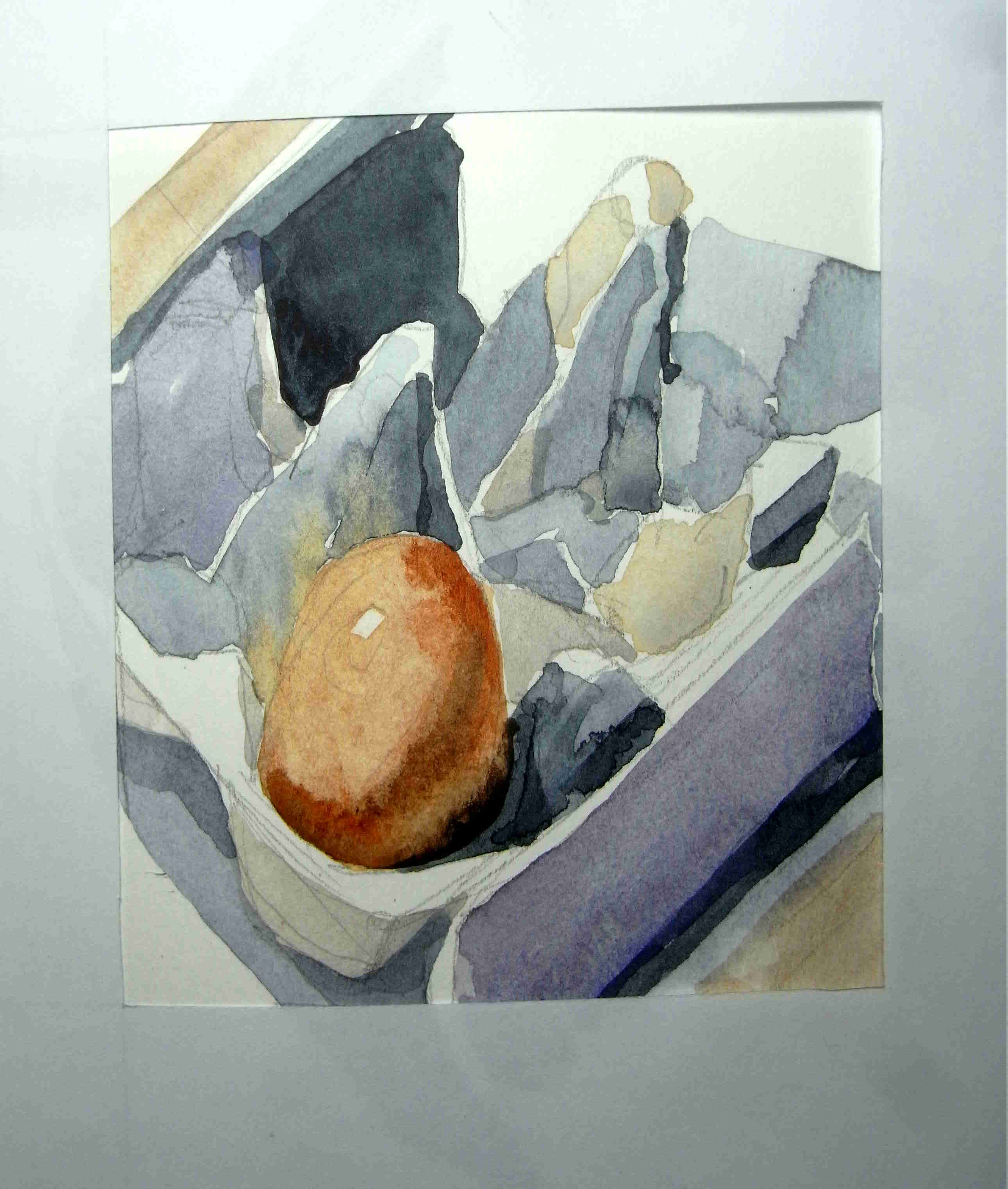
I’m translating a reference photo taken by an artist friend into ostensibly a watercolour, but ultimately in mixed media.
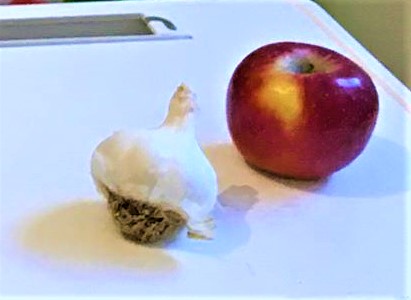
The garlic in the photo isn’t particularly attractive – the root base is too big (I’d normally sketch it from different angles first) and my main challenge will be to make it “look” like a garlic, which is often helped by having a detached clove next to the bulb. This is very much an exercise in white-on-white, so looking carefully for patches of colour is extremely important. You’ll notice it is lit from several light sources; artists often make things easy for themselves by just working with one (or two) light sources. I like the mix of blue and purple shadows (right) and yellow ochre (left).
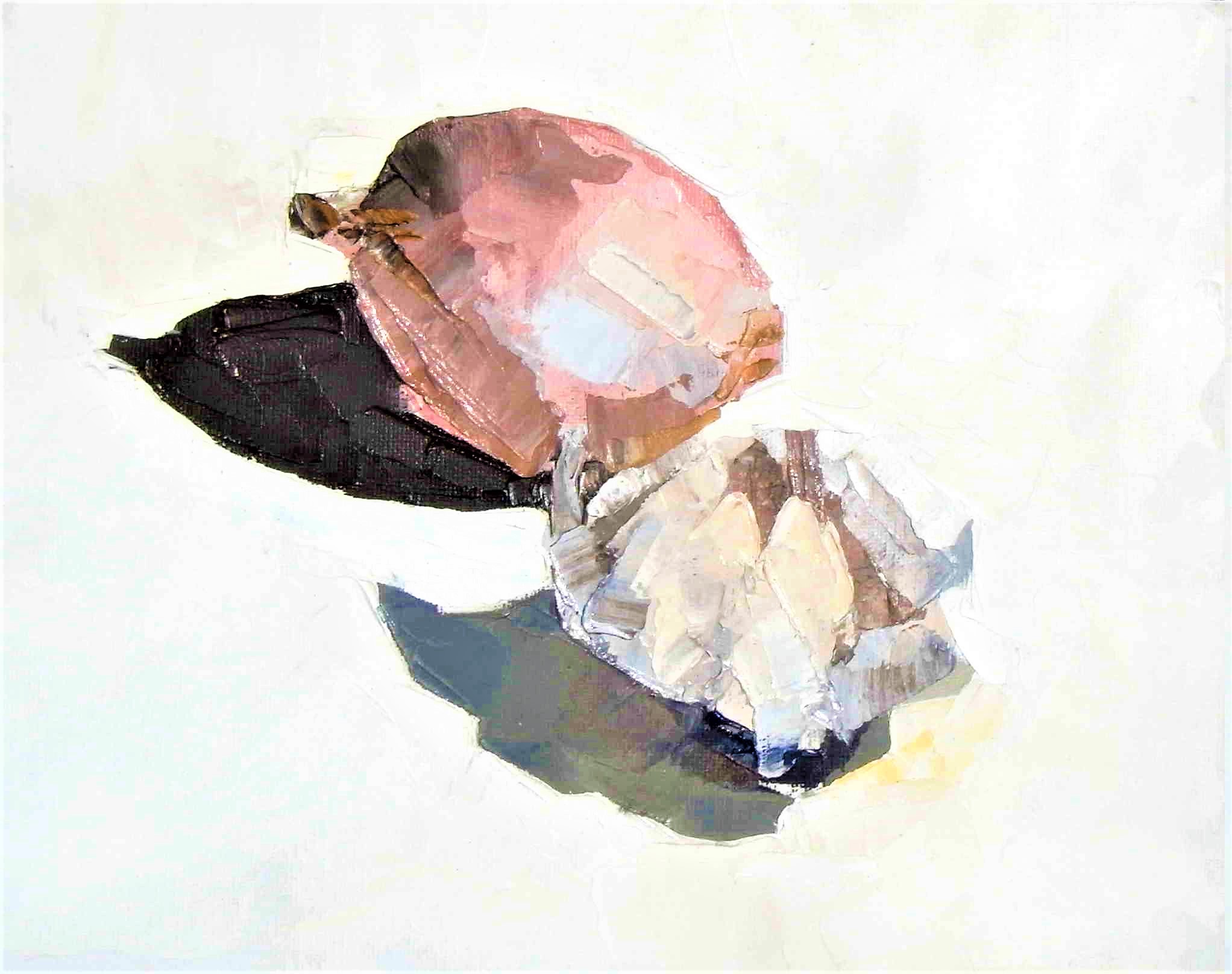 I like to think about precedents – similar objects or poses I’ve done before. Here’s one in oils from a few years ago. It doesn’t “read” as a garlic bulb particularly well, riding on the back of the neighbouring onion instead. Importantly there are many colour “patches” in the blub and in the shadow. This was painted in sunlight so the shadows are very distinct.
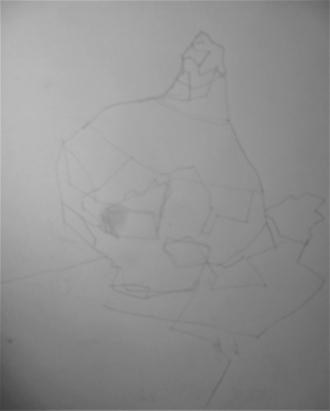
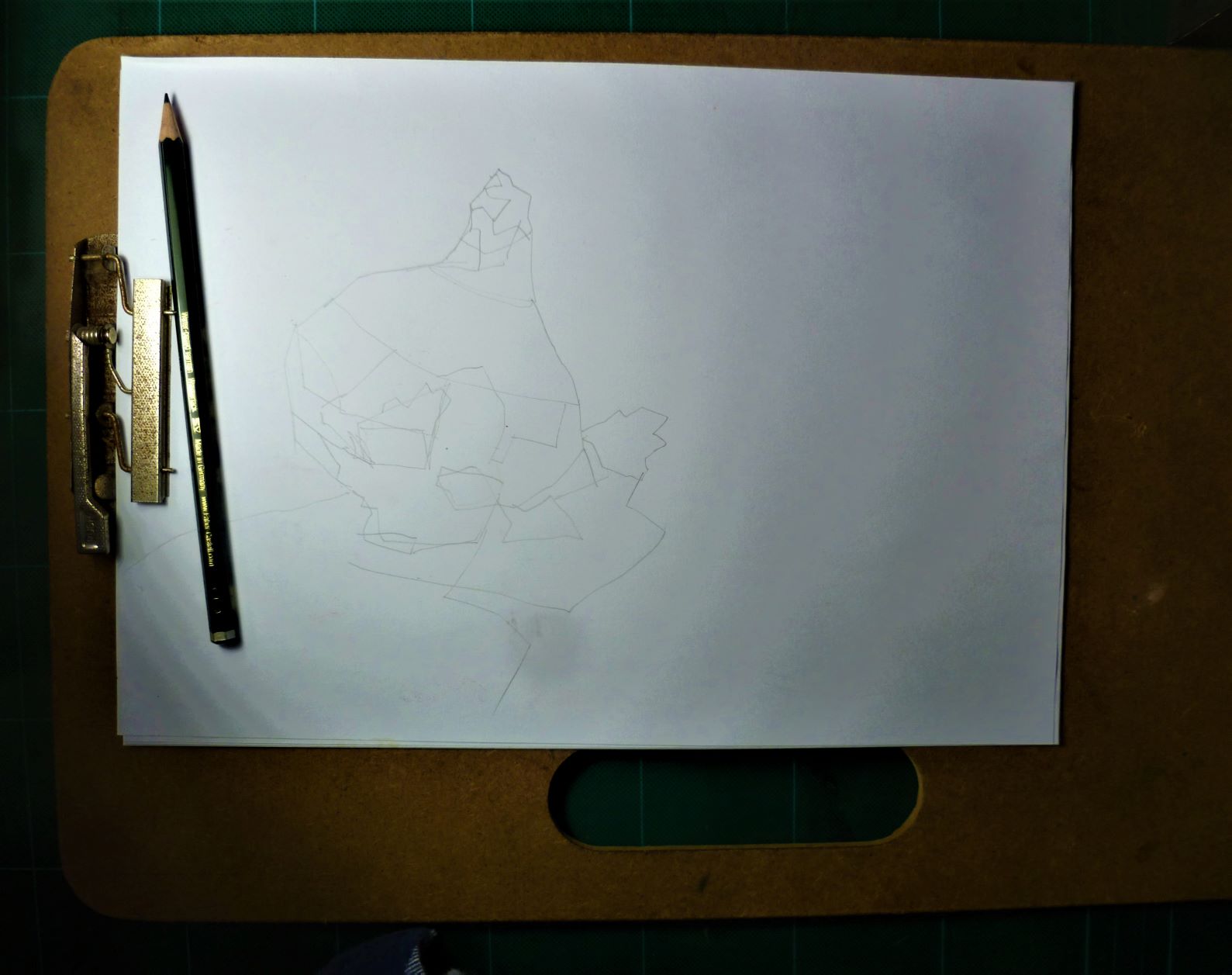 I spend five minutes drawing it with a hard pencil (Staedtler F) on A4 80gsm photocopy paper. I am simply copying the shapes as I see them on the garlic. I am not separating the object from its shadow. I am not worrying about keep the shapes separate; I am focussed on making the shapes as “interesting” as possible.
 I spend one minute thinking about format and decide on portrait rather than landscape.
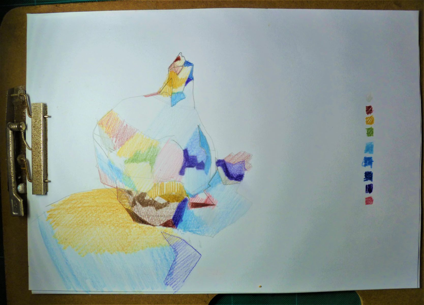
I spend ten minutes looking at the shapes carefully and assessing their colour. I use watercolour pencils, making sure each colour is spread across the page in a balanced way (not all the blues in one area, for example); again I’m not worried about separating the object from its shadow because I know in watercolour it’s important they are blended together. I’m not being fussy here about making a piece of “art”; I’m just recording colours as I see them.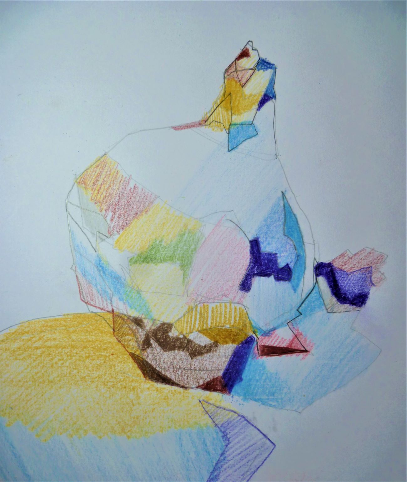 The ugly roots at the bottom are a worry but I trust in my ability to correct them in the painting.
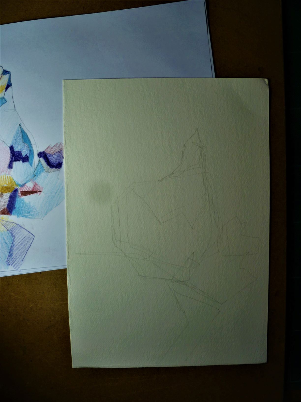
I do a freehand copy from the rough drawing on to 300gsm cold-pressed (smooth) watercolour paper, approx. 18x25cm (please ignore the grey spot – that’s my dodgy camera’s fault). I am not happy with the overall shape so using a light box do a rough tracing from the rough (the rough has a nice “fat” look to the garlic bulb which I want to retain). I am keenly aware of the “Rule of Thirds” here: I want the viewer’s eye to go to the bottom right corner of the bulb where it meets the shadow (see pink/white/red area in the photo) – it is roughly 12cm from the left side and 16cm from the top. The composition must follow traditional design principles, hence following the Rule of Thirds!
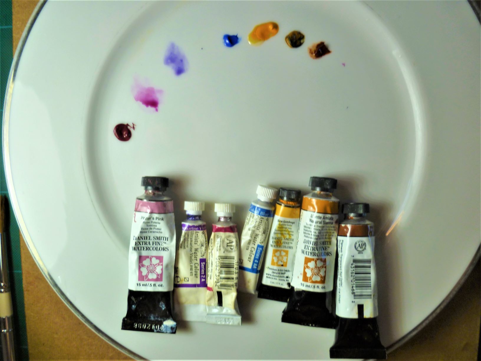
The colours are laid out next. A bit like Asian cooking, it’s all about getting the ingredients ready – you can’t lose valuable time unscrewing lids! The purples have dried in the tube but thankfully most colours will be pale; if they were oils which were dried up, I’d have to throw them away, but watercolour can be reconstituted from the dried paint, unless of course you need them for “darks” in which case you need a new tube!
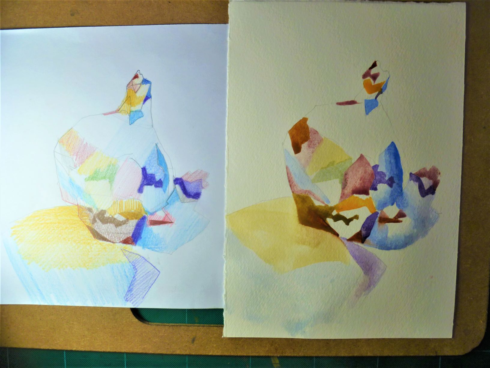
Here I am working not from the original photo but from my rough. It’s a bit like painting- by-numbers because I am desperate to maintain the interesting character of each colour patch. I am applying colour direct from the palette – no washes, no laying one colour over another: I want the colour to stay “fresh”. I am using a small dagger brush to keep nice strong edges and angles. You’ll notice too that I have used mainly straight lines in my foundational drawing: I want to give my garlic some muscular character. I am working on a slight incline so the paint will run a little; I’m not worried too much about one colour running into another, trying not to sacrifice the interesting colour shapes. At this stage, I am ready to throw it out and start again – some areas are darker than I want. I will now let it dry then come back later, working more closely with the source photo, adding ‘improvements’ with lead pencil, coloured pencils, even some over-painting with gouache if necessary.
Daily Drawing – 90mins – The Rocks, Sydney
February 9, 2018
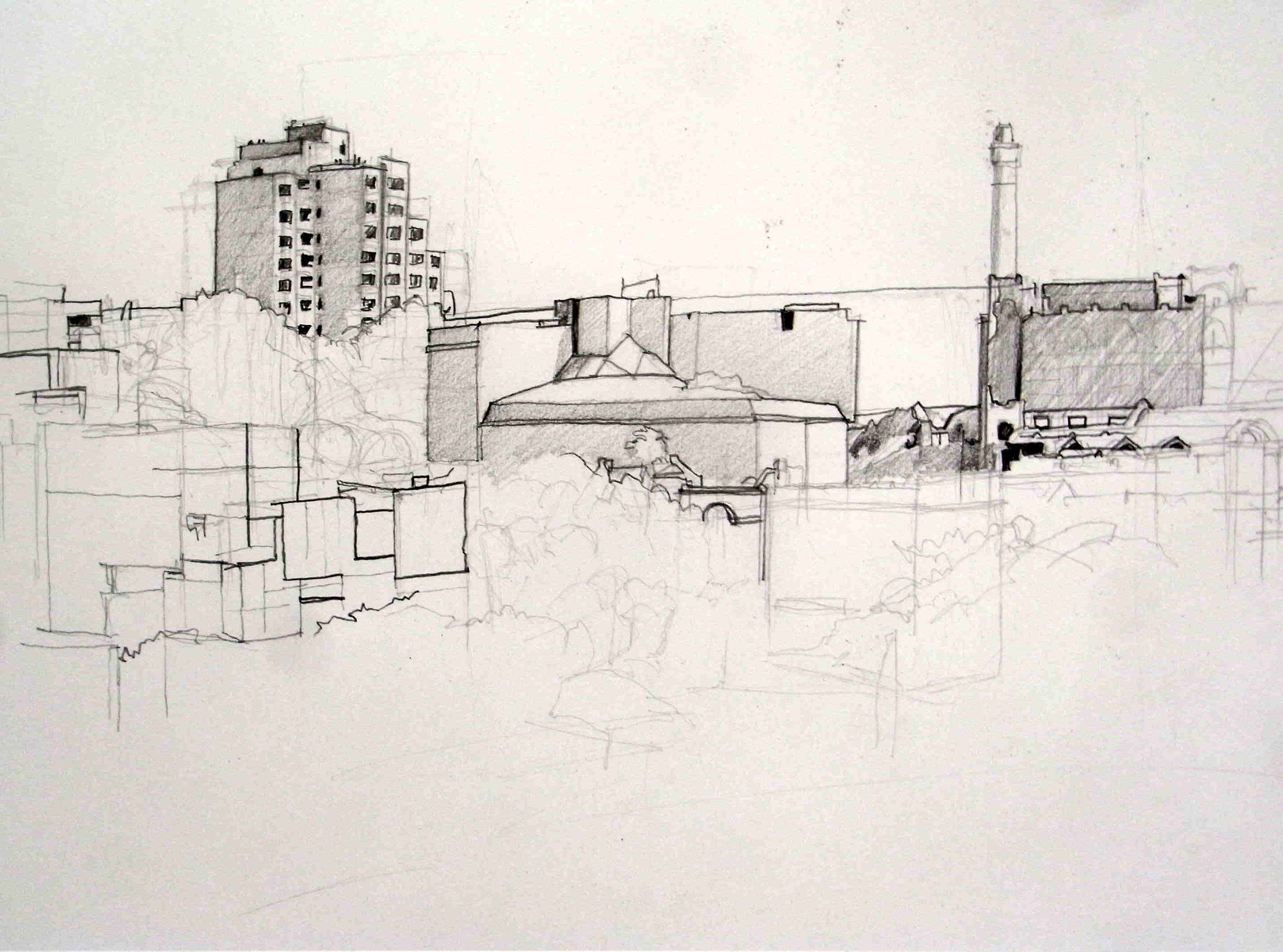
Mitsubishi H and 4B pencil on A2 cartridge paper 110gsm
Another sunny morning with strong cast shadows, so an opportunity to good to pass up to go back to The Rocks in Sydney where I drew this view earlier this week. Today, instead of drawing ‘freehand’ without any careful or comparative measurement as I progressed, I aimed today for a more ‘correct’ drawing, for careful representation of the ‘boxes’ in the environment and an acknowledgement of shadows.
The focus of the sketch is the Sirius building, an example of Brutalist architecture, examples of which in Sydney are being disguised and their strong features softened these days, or, in the case of Sirius, likely to be demolished and sold off for luxury apartments. I’ve consciously included windows in the Sirius because it is the last large building in the area to house residents, the other buildings being offices, hotels and in the case of lower left, the Museum of Contemporary Art annexe. Drawing is a political act and this was an ideal opportunity to provide commentary on the rapacious actions of the super-rich in Sydney destroying the lives of the poor. That community housing will be better off by the building being sold is of course fallacious and specious: the ends don’t justify the means of dislocating the lives of the most of the vulnerable in the community.
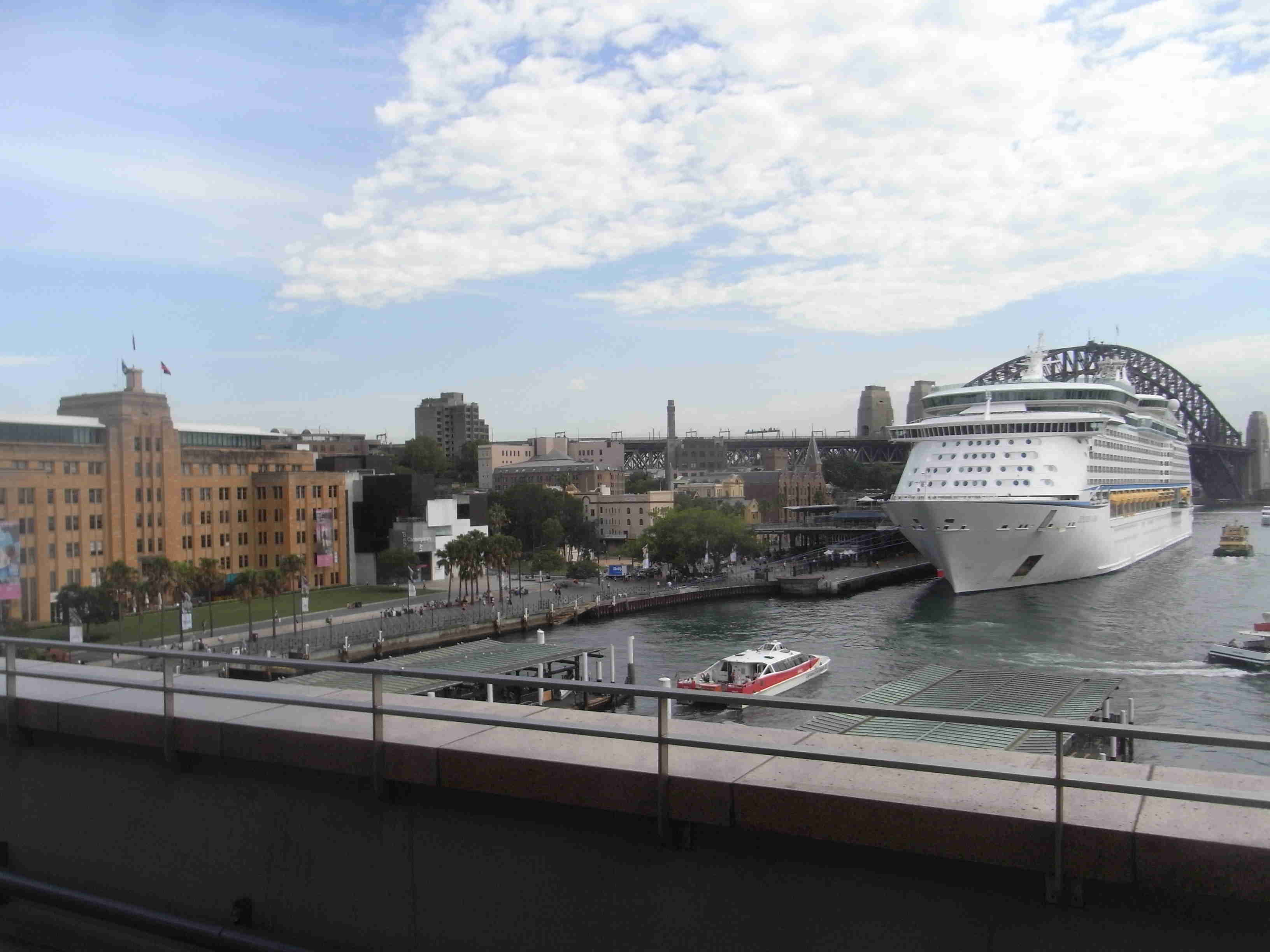
I will leave the inclusion of ocean liners to another day; to draw them exactly would create a sketch which will be too lop-sided to read as realistic.
I took photos of the various ferries coming and going from Circular Quay below and they will make interesting studies in gouache for a later date.
Daily Drawing (timed 20mins) 25jan18
January 25, 2018

Now we’re getting technical: I’m reconciled to the fact that drawing pencil will never have the fineness of purer pigment as in pastel, especially in conveying skin. Ever-present is the filler associated with pencils and not pure pigment.
This week’s drawings have particularly eschewed colour to minimise the distraction of conveying the surface of skin exactly.
Perhaps the most room for improvement comes with proportions and the best way for me to study that is to examine carefully the photo upside down to see where I went wrong, combined with a planar study (brow muscles in particular). Characterising hair is also proving difficult.
I’m reading Charles Reid’s book on figurative watercolour at the moment so seeing shapes, especially shadow shapes, is important.
Daily Drawing (timed 20mins) 23jan18
January 23, 2018
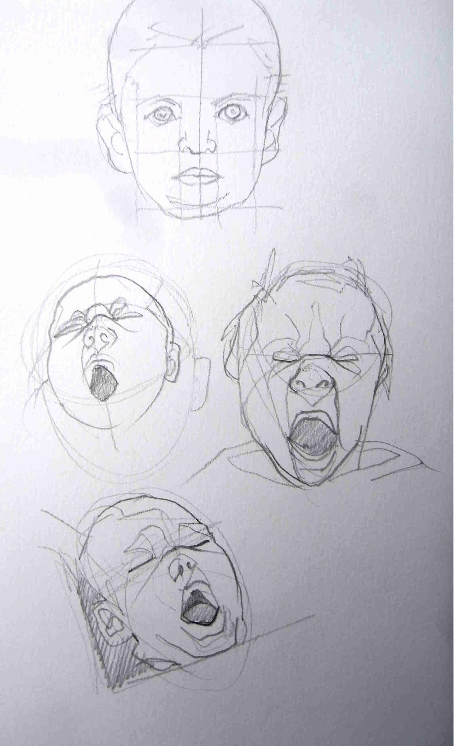
More on this week’s theme of Yawning Babies.
A consideration of facial structure. I’m very conscious of the fact that the yawning creates very prominent movement in the main muscles around the brows and the chin.
Daily Drawing (timed 20min watercolour) – 10jan18
January 9, 2018
Venezia Sketchbook 9×5″ Fabriano Accademia 200gsm Medium, 9x11cm, the repository of all my current daily drawings and plein air sketching. The paper holds the washes used in Derivan Liquid Pencil quite well, but there is cockling with these current daily watercolour drawings.
Changed brushes (Rosemary R2, Kolinsky #8) which holds water well for bigger washes but without a sufficiently fine point for the detailed work. The R13 brush, which I think would fit the bill, is out of stock here at the moment and difficult to obtain in a hurry.
To my foundation W&N Payne’s Gray, I added some Daniel Smith warms today. The granulation is not brilliant on this student watercolour paper, so I might try some Arches Cold Press 185gsm in tomorrow’s drawing, just to compare.
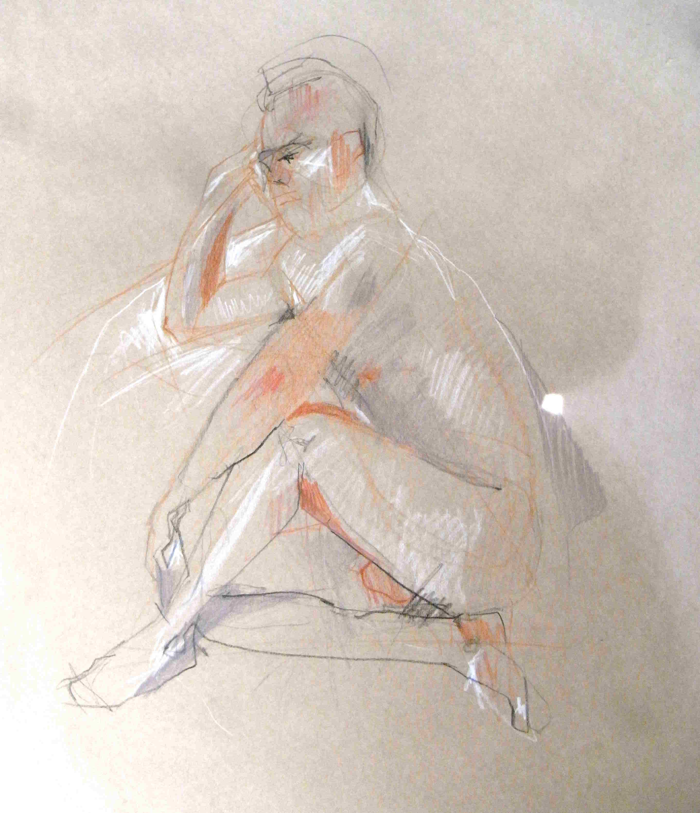
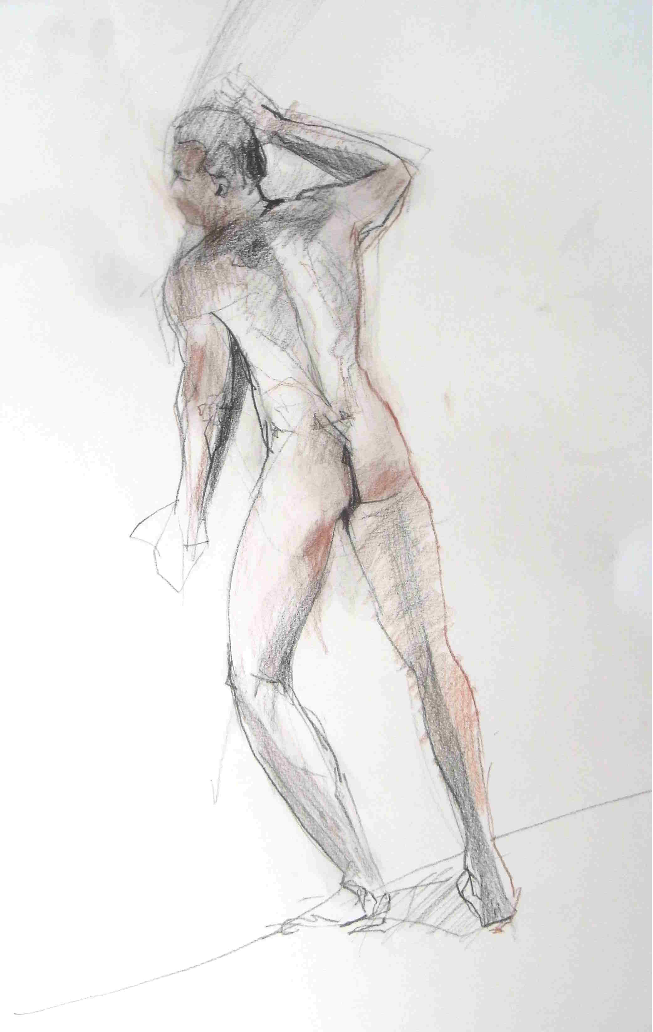
Life Drawing
December 9, 2017

20mins; Conte a Paris pencils – black, white, sanguine on Kraft paper A2 80gsm.
I started with a minimum of construction lines in Lyra Skin tone (light brown), a coloured pencil with a degree of oil content, then quickly moved to white Conte. The mid-tones I left as bare brown paper and then alternated between black and sanguine. The black were for obvious shadow and sanguine for any contours or shadow which weren’t distinctly dark. The most significant weakness was the outstretched leg at right. I had issues with the head because the chin was concealed under a beard, the details of which would have taken too much valuable time. I expect to reduce rehashed contour over time.
10mins; Lyra Skin Tone coloured pencils (Germany) on Kraft paper A2 80gsm.
This earlier pose was done in coloured pencils only. It was difficult to juggle sixteen different pencils and I’ll slim them down to just a few next time. I learned from this study not to mix Lyra pencils and Conte pencils – Conte doesn’t work on top of Lyra because of the latter’s oil content. Insufficient time was spent on getting the correct overall proportions – limb size in particular. My only excuse is that life drawing is tiring!

10mins, black (Pierre Noir) Conte a Paris pencil on Canson cartridge A2 120gsm
I’ve learned not use willow charcoal on a paper as slippery as cartridge, so I opted for black Conte pencil. With the model so close and with no room for me to move backwards either, I felt the proportions slipping away the further down the page I went. The pose went for longer than 10mins, I suspect, mainly because I kept refining the contour as the model ever so subtly corrected the torque in his pose. At one stage or other, there was more dynamism in the pose than I’ve conveyed – explicit in the lack of downward line between the armpits. It’s important to note that there was a light form behind and to the right of the model so the entire right side of the body had this wonderful white line running down the outside. Daylight was prominent from the left (but not too high up). Wonderful bone articulation available in the front knee – I should check other artists to see how this forward pressure presents itself in the bended knee.

10mins, black (Pierre Noir) Conte a Paris pencil on Canson cartridge A2 120gsm
The poor model pushed himself to his physical limitations in this one and the tension was palpable! I seem not to have got the proportions of the arm closest to his face correct.

10mins, Conte a Paris pencils (black, sanguine) and Lyra Skin Tone pencils on Canson cartridge A2 120gsm
I thought the two media would mix but they didn’t. More practice on hands required.
20mins. Conte a Paris pencils (black, sanguine) on Canson cartridge A2 180gsm.
This splendid pose should have produced a better drawing. There was a single source of direct light at near floor level. The leg at right ought to have been drawn closer to me. Today’s drawings show me I need to work more on lower legs and perhaps push the pose in terms of dynamism, event to the extent of ‘not’ drawing what I actually see. The whole body could have been drawn slightly larger on the page than I did – at this size, graphite pencils would have been a better medium.
“Hard Man” – silicon bronze casting, lost wax method
September 26, 2015
Hard Man is an exploration of masculinity, in particular behaviours passed on from fathers to sons. Unlike Australian painter Ben Quilty’s focus on the vulnerability of young Australian males leading to risk-taking, I’m interested in male conditioning and parenting, ideals about masculinity passed from working class men to their sons over many generations, originating in the perception that males need to ‘harden’ in order to fight for survival and that a “soft man” rates not at all.
I began with working ‘Victory’ Brown, a microcrystalline wax, easily manipulated when heated, and experimented also with polymer clay. The wax quickly became more important since I wanted an expressionistic surface treatment rather than a smooth surface texture. I was interested in the ‘additive’ sculptural techniques of Giacometti, the combination of naturalism and abstraction evident in Henry Moore and the combination of the realistic and the mechanistic in the work of Ipousteguy. Less important to me were the smoother surfaces in the work of Matteo Pugliese. The head and torso forms were drawn from Nuragic sculpture from Ancient Sardinia, a close look at all the European Ancient sculpture traditions, as well as Japanese yoroi armour. The exhibition of work from the Benaki Museum in Athens on show at the Hellenic Museum in Melbourne was very useful, as were the Rayner Hoff reliefs at the Sydney ANZAC Memorial.
Scale is significant. I wanted the final product to be small, representing my individual, personal power over the ‘syndrome’ of male conditioning, thus limiting the size of the final work at around 100x100x50mm.
The following photos shows the sequence from wax and polymer clay studies to silicon bronze casting from wax, to patina through the application of base metal paint overlaid with a violet solvent mixed with beeswax.
Photo 1. Polymer clay, exploring smooth surface texture.

Exif_JPEG_PICTURE
Photos 2 and 3. Wax studies. The issue of a plinth arose at this time. I was careful to create a hole potentially suitable for a rod for a standing position, echoing the work of Giacometti, but I was also happy with a lying-down position with no support or plinth, echoing the fallen warrior series of Henry Moore.

Exif_JPEG_PICTURE

Exif_JPEG_PICTURE
Photo 4. Untreated silicon bronze casting, in a matt ashen grey colour, fresh from the foundry, Shaw Process Casting (Mortdale, NSW, Australia). I was forewarned that I might lose the ‘tail’ at the bottom of the torso because the wax was too thin; one of the arms was also perilously loose. The resulting cast had two interesting features: a bend in the head and a very sharp bend in the ‘cod piece’. Serendipitously, the sculpture became self-supporting, resting on one hand, the codpiece and one of the arms, thus resolving issues about a plinth.

Exif_JPEG_PICTURE
Photo 5. Bronze casting patina: two layers of Bronze B Metal Coating (Barnes, http://www.barnes.com.au), producing a bronze/copper look. Despite having an overall “painted” appearance, the layers didn’t obliterate my fingerprints in the wax original.

Exif_JPEG_PICTURE
Photo 6. Bronze casting patina: Solvent Dye Color – Violet from SculptNouveau (www.SculptNouveau.com, distributed by Barnes Products, http://www.barnesproducts.com.au) mixed with liquid beeswax. I adopted a ‘warm’ colour for the patina, wanting to ‘domesticate’ the work rather than elevate it to the position of “High Art” with a traditional green or black patina.

Exif_JPEG_PICTURE
Art as a Business: lecture notes
May 19, 2015
Last night, I had the good fortune to attend a lecture, entitled “Art as a Business”, given by the Arts Law Centre of Australia. St George School of Fine Art graciously provided the venue and the event was supported by Kogarah Council. It was well attended both by student colleagues and by members of the St George Art Society.
Here is the ‘Top 10’ advice I took away from the event.
1. Re-read Julia Cameron (The Artist’s Way or any other of her books). And put her ideas into sustained practice.
2. Decide whether you’re an Anonymous-Attic-Artist or an Artist-who-Operates-in-the-Public-Domain. Consult http://www.artslaw.com.au and http://www.fairtrading.nsw.gov.au for more information.
3. If you an artist operating under your own legal name, there’s no need to formally register a Business Name. Operate as a Sole Trader using your legal name (see business.gov.au).
4. Get an ABN (even if you don’t make the minimum threshold tax level of $AU18,300). Keep in mind that formal arts funding, e.g. grants from local Councils, usually requires one since they most often fund auspiced entities and not Sole Trader individuals, given their stringent reporting responsibilities and transparency to LGA ratepayers.
5. GST only comes into play if you’re making $A75,000 or more.
6. Check ASIC Connect and ATMOSS to see if another artist somewhere else is already using a name identical to yours. Be clear in your own mind about the differences between a Business Name, a Trademark and a Company Name.
7. Registering a Company is expensive and onerous in terms of reporting and compliance; too difficult for a Sole Trader.
8. If working collaboratively (especially over a long period of time) with another artist, consider a written/signed/witnessed Partnership Agreement to minimise misunderstandings.
9. If receiving income from several revenue streams (e.g. day job, part-time jobs) including working as an artist Sole Trader, you’ll be taxed by the ATO as a single tax-paying entity. Write off art production expenses against the whole-of-income. Don’t worry about whether your art is a loss-making enterprise year on year, the ATO is only interested if you don’t declare income, not if it makes a profit or not.
9. Check your insurance: not just personal injury but things like home studio, theft of expensive cameras, external visitors visiting your home as part of your business activity.
10. If insurance is difficult/expensive, actively consider mitigating or limiting the risks. Keep in mind that galleries will often insure your work during an exhibition, but you will have to insure work travelling to and from the gallery: check the gallery’s fine print.
Daily Painting Challenge, January 2015, Day 20
January 21, 2015
Polyvinyl acetate
oil on canvas panel, 6×6″
I’ve returned to a Morandi-style still life of plastic containers today; very rough-and-ready. After nearly three weeks of palette knife, I’m looking forward to using a brush again.

Thirty Paintings in Thirty Days, January 2015, organised by Leslie Saeta (http://lesliesaeta.blogspot.com.au).
Reference: Stern, Arthur. How to see color and paint it: a series of projects designed to open your eyes to colors you never saw before. New York, Watson-Guptill, 1984.
