Australian Wood Duck
May 1, 2020

Australian Wood Duck, 8×10″, watercolour/gouache/coloured pencil on mixed media sketchbook.
Day 1 of Every Day in May 2020, Sydney Sketchclub Meetup.
Mixed Media, Still Life. Part One.
April 24, 2020
I’m translating a reference photo taken by an artist friend into ostensibly a watercolour, but ultimately in mixed media.
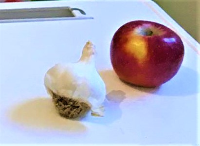
The garlic in the photo isn’t particularly attractive – the root base is too big (I’d normally sketch it from different angles first) and my main challenge will be to make it “look” like a garlic, which is often helped by having a detached clove next to the bulb. This is very much an exercise in white-on-white, so looking carefully for patches of colour is extremely important. You’ll notice it is lit from several light sources; artists often make things easy for themselves by just working with one (or two) light sources. I like the mix of blue and purple shadows (right) and yellow ochre (left).
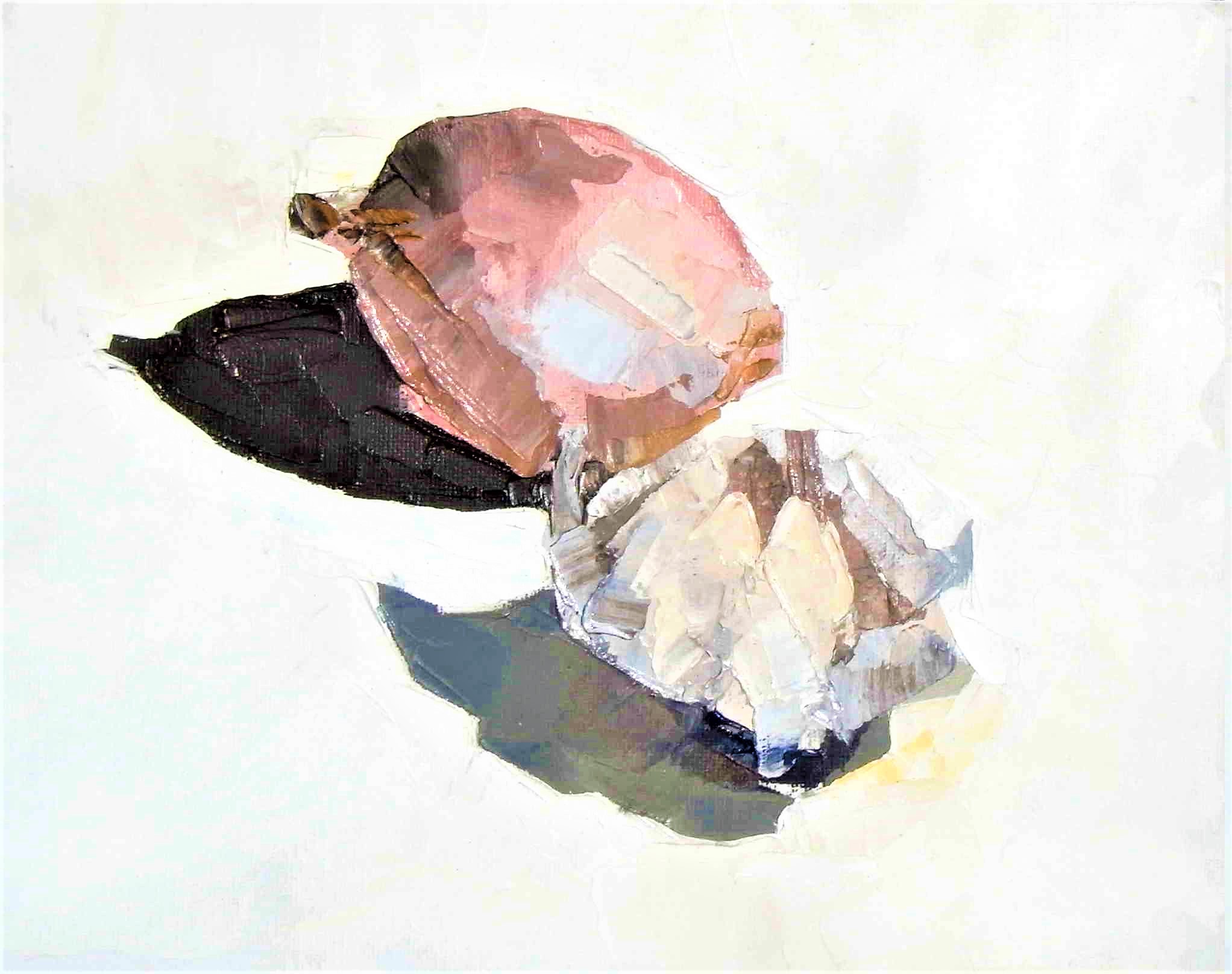 I like to think about precedents – similar objects or poses I’ve done before. Here’s one in oils from a few years ago. It doesn’t “read” as a garlic bulb particularly well, riding on the back of the neighbouring onion instead. Importantly there are many colour “patches” in the blub and in the shadow. This was painted in sunlight so the shadows are very distinct.
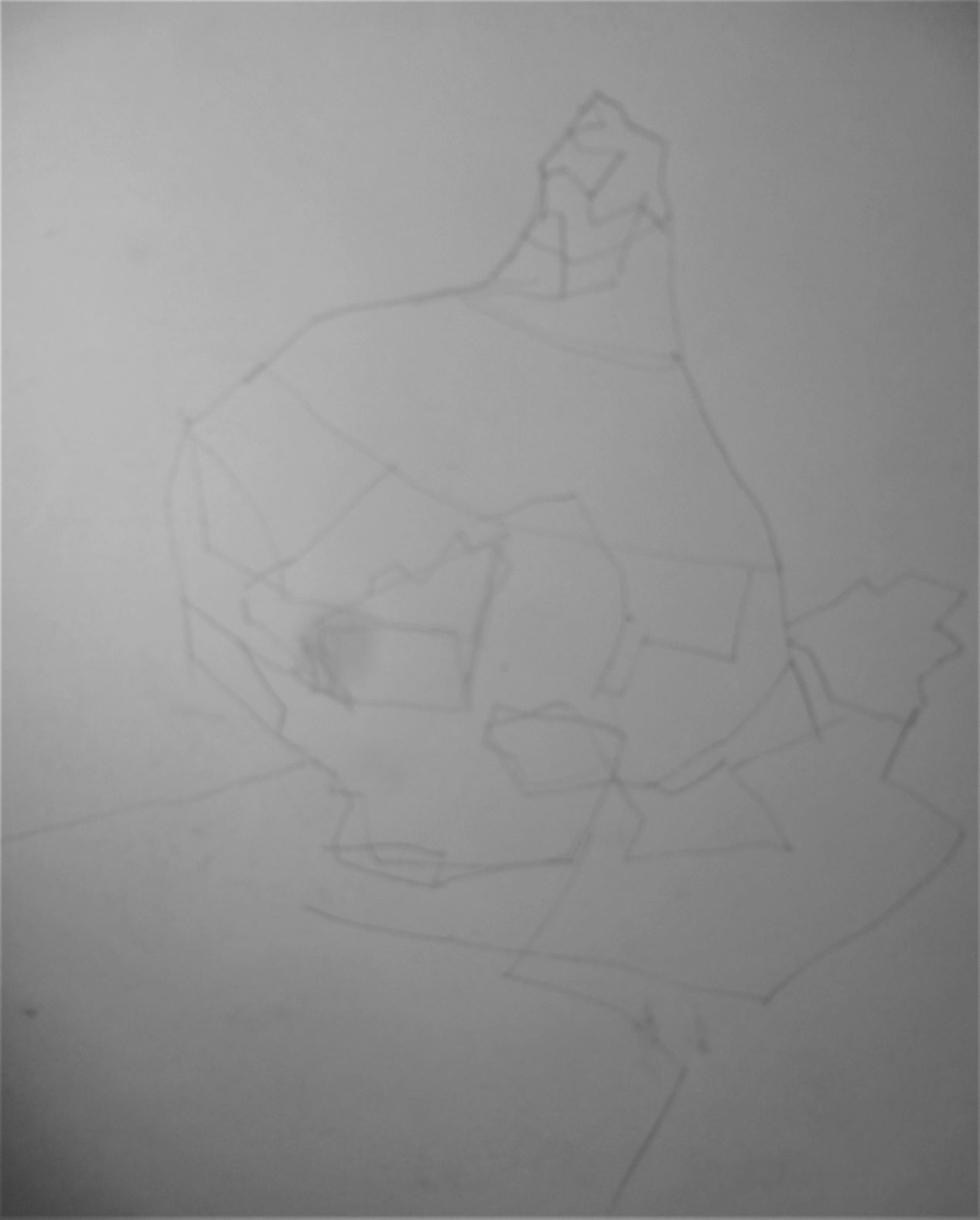
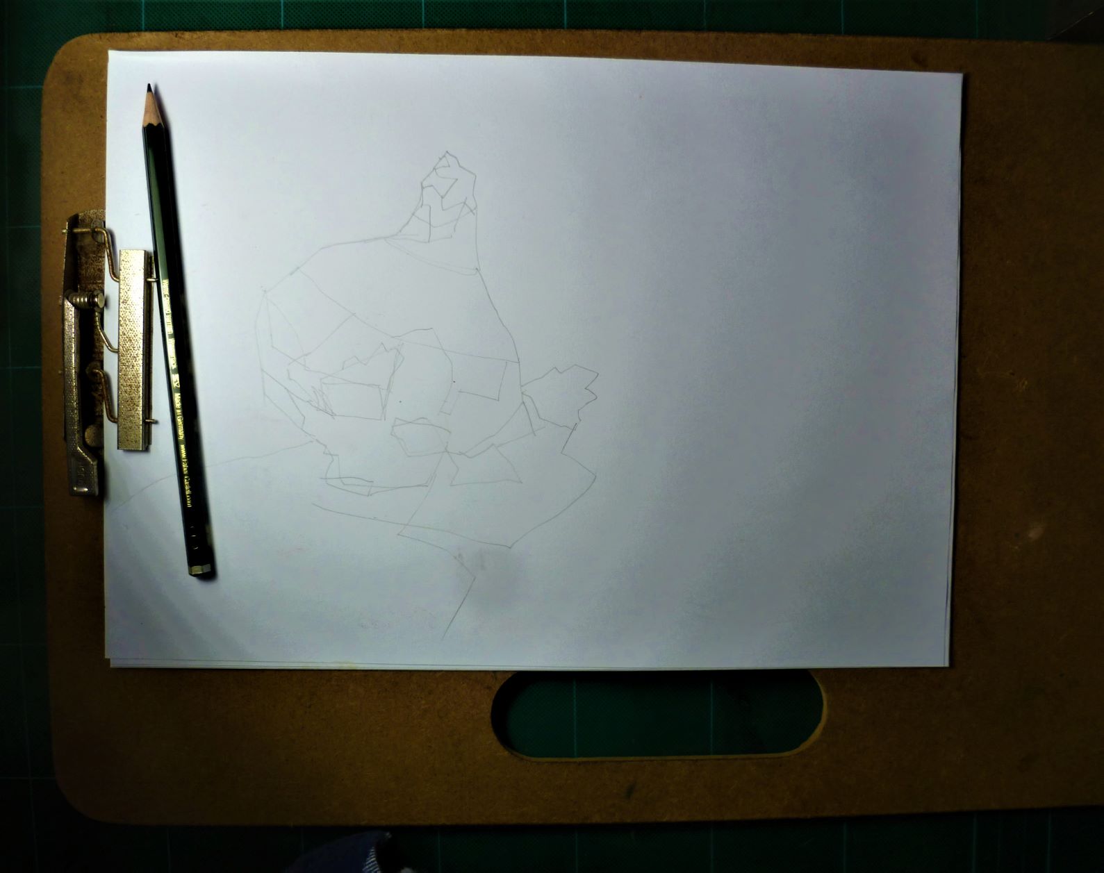 I spend five minutes drawing it with a hard pencil (Staedtler F) on A4 80gsm photocopy paper. I am simply copying the shapes as I see them on the garlic. I am not separating the object from its shadow. I am not worrying about keep the shapes separate; I am focussed on making the shapes as “interesting” as possible.
 I spend one minute thinking about format and decide on portrait rather than landscape.
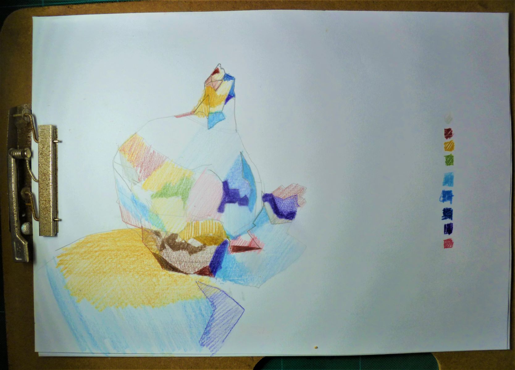
I spend ten minutes looking at the shapes carefully and assessing their colour. I use watercolour pencils, making sure each colour is spread across the page in a balanced way (not all the blues in one area, for example); again I’m not worried about separating the object from its shadow because I know in watercolour it’s important they are blended together. I’m not being fussy here about making a piece of “art”; I’m just recording colours as I see them.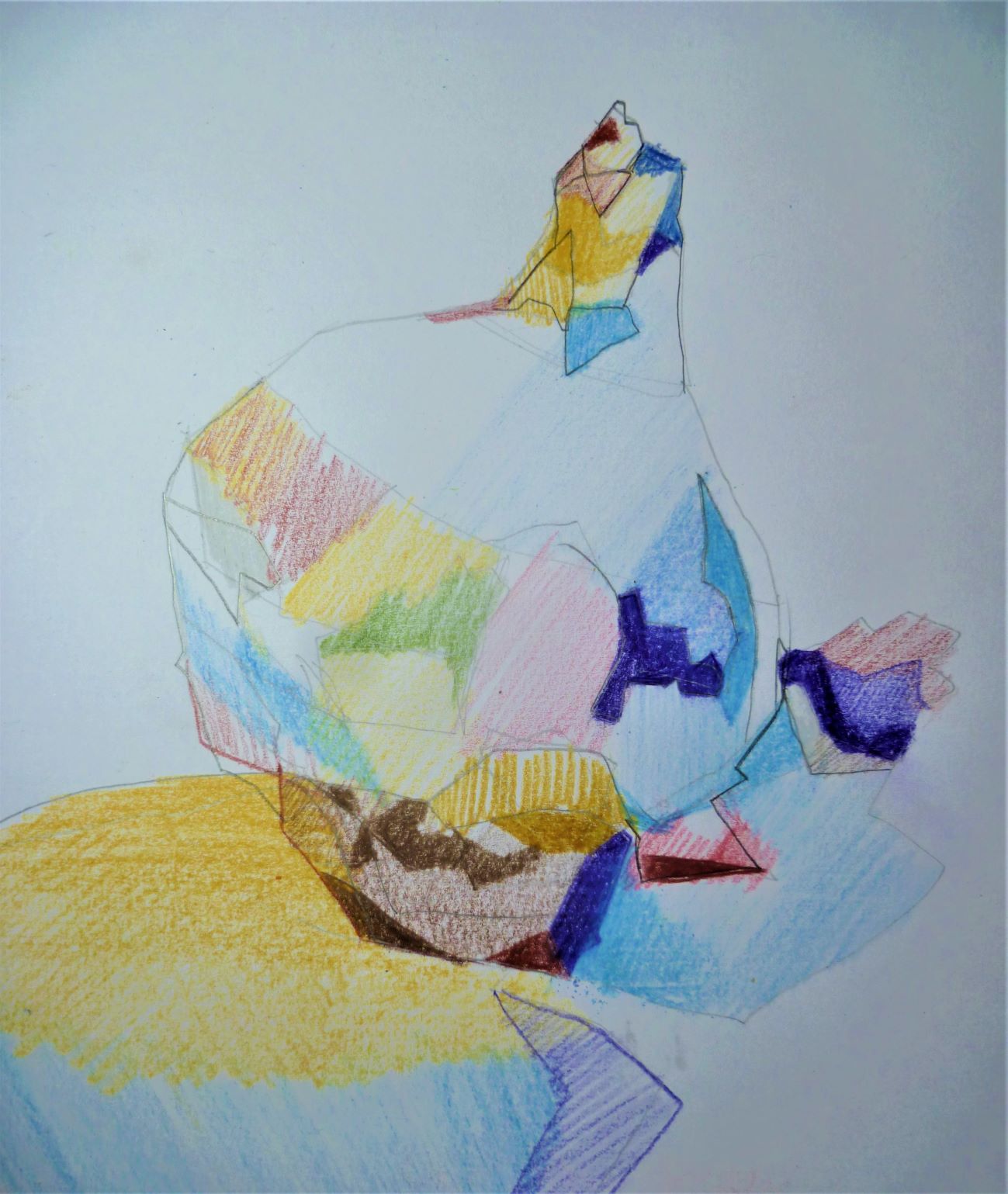 The ugly roots at the bottom are a worry but I trust in my ability to correct them in the painting.
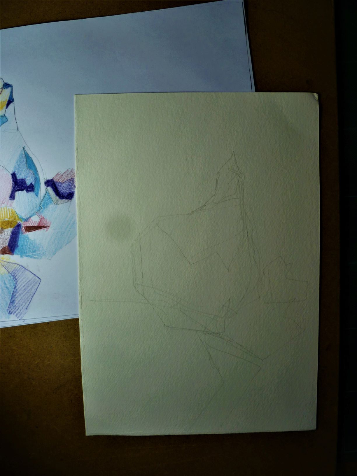
I do a freehand copy from the rough drawing on to 300gsm cold-pressed (smooth) watercolour paper, approx. 18x25cm (please ignore the grey spot – that’s my dodgy camera’s fault). I am not happy with the overall shape so using a light box do a rough tracing from the rough (the rough has a nice “fat” look to the garlic bulb which I want to retain). I am keenly aware of the “Rule of Thirds” here: I want the viewer’s eye to go to the bottom right corner of the bulb where it meets the shadow (see pink/white/red area in the photo) – it is roughly 12cm from the left side and 16cm from the top. The composition must follow traditional design principles, hence following the Rule of Thirds!
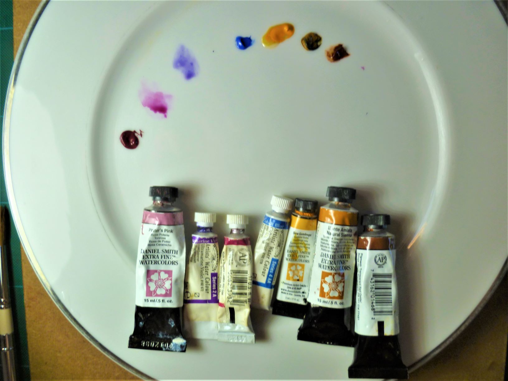
The colours are laid out next. A bit like Asian cooking, it’s all about getting the ingredients ready – you can’t lose valuable time unscrewing lids! The purples have dried in the tube but thankfully most colours will be pale; if they were oils which were dried up, I’d have to throw them away, but watercolour can be reconstituted from the dried paint, unless of course you need them for “darks” in which case you need a new tube!
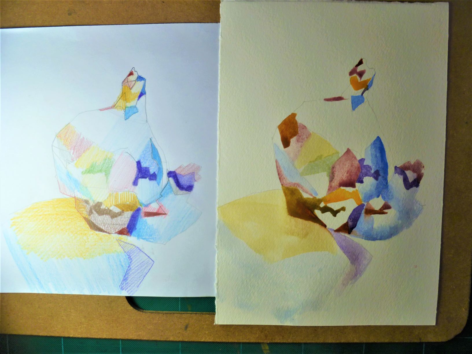
Here I am working not from the original photo but from my rough. It’s a bit like painting- by-numbers because I am desperate to maintain the interesting character of each colour patch. I am applying colour direct from the palette – no washes, no laying one colour over another: I want the colour to stay “fresh”. I am using a small dagger brush to keep nice strong edges and angles. You’ll notice too that I have used mainly straight lines in my foundational drawing: I want to give my garlic some muscular character. I am working on a slight incline so the paint will run a little; I’m not worried too much about one colour running into another, trying not to sacrifice the interesting colour shapes. At this stage, I am ready to throw it out and start again – some areas are darker than I want. I will now let it dry then come back later, working more closely with the source photo, adding ‘improvements’ with lead pencil, coloured pencils, even some over-painting with gouache if necessary.
Location sketching – Cronulla NSW
January 19, 2019


The main street of Cronulla NSW long ago changed into a mall but is still redolent of cars and trucks from my childhood memories. Sitting here, I get flashbacks of how things used to be.
Other sketchers in today’s group concentrated on a clocktower in the middle of the mall, flanked by white stall marquees, creating a strong single-point perspective design. As an alternative, I checked out the relatively few architectural monuments along this narrow street; getting an interesting vantage point was not easy, the oldest buldings having been repurposed and having lost a lot of their glorious past as free-standing buildings.
I chose less obvious subject matter, a “side view” of the mall, with no central focus. There is a lot of “mess”, a lot of people and a lot of noise. Not exactly sure of what I would find – if indeed I would “find” anything – I did my usual thing and started with a hard H pencil to create some sort of framework. This dragged out for forty minutes with nothing coming to the surface. At one point, an inquisitive stranger stopped to ask me if I had my vanishing point and orthogonal lines in place.
I got talking with two other sketchers at this point and we discussed things like tone and direction lines and pentimenti. Pentimenti was raised in the context of pace: slow sketching focussing on realistic, naturalistic representation or looser, more expressionistic sketching to portray mood and emotion. We talked also about developing a signature style, one that is subsconciously unique to us and immediately recognisable to others.
We had a go at quick continuous line drawing, a chance for me to play with quill feather and ink, fineliner and yellow highlighter. The idea behind this is to familiarise ourselves with a wide range of the object’s qualities before we settle on one aspect or one feature. Ordinarily eight three-minute sketches of an object in different positions is a useful way to spend half an hour.
This resulted in we three sketching for ten minutes the same subject: a tonal sketch of two other sketchers in the distance and another of a bright white umbrella.
My drawing of the people was small, almost sight-size, with an emphasis on tone and shapes.
We discussed approaching a sketch of the umbrella, I positing that the architecture of the umbrella was primary (focussing on the pole!). Because the horizontal triangle was so difficult in its own right, my sketch concentrated on creating the white as a negative space: I worked on the spatial geometry of the windows and background to create the white for me.
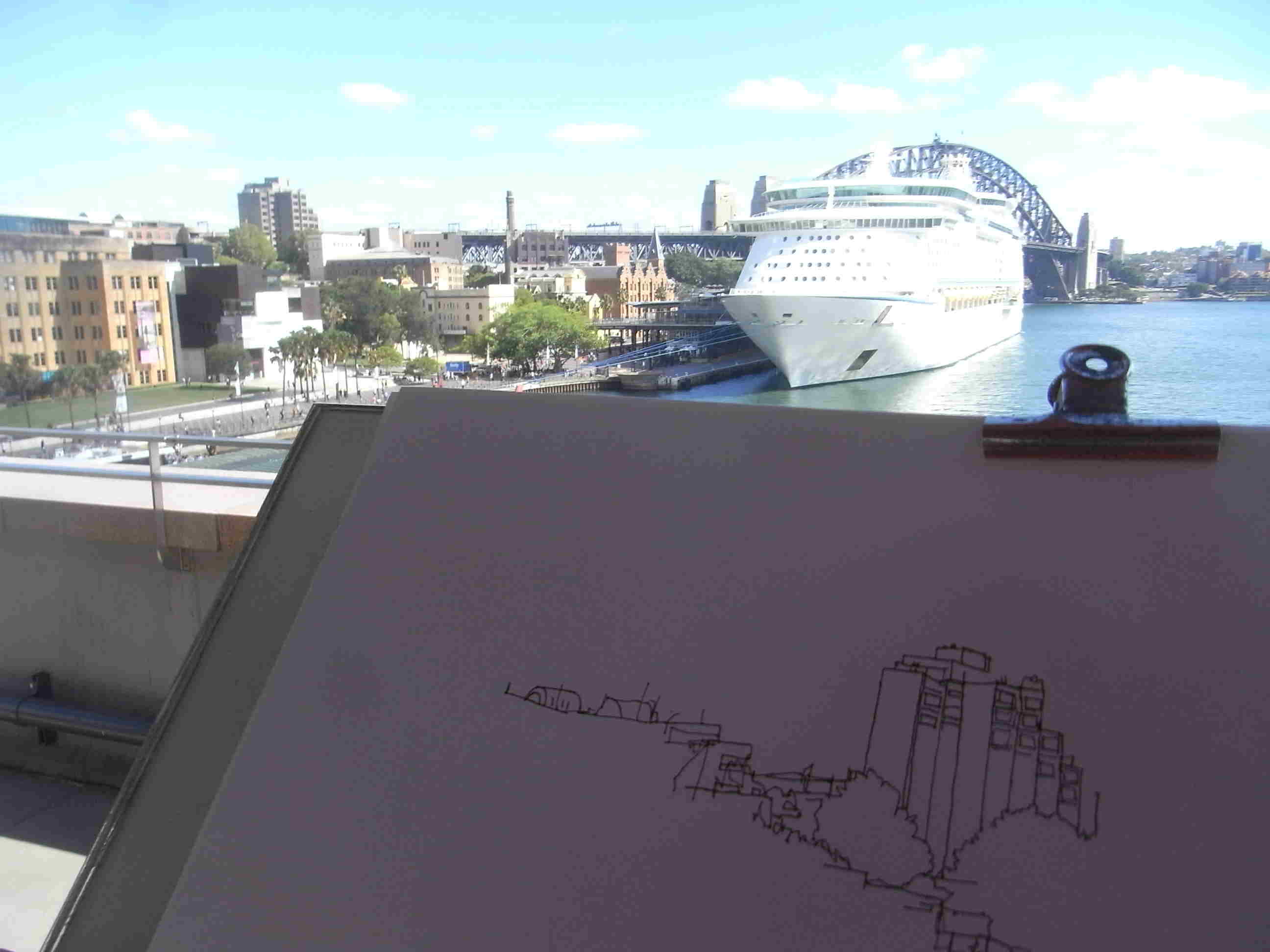
Daily Drawing – 90mins – The Rocks, Sydney
February 9, 2018
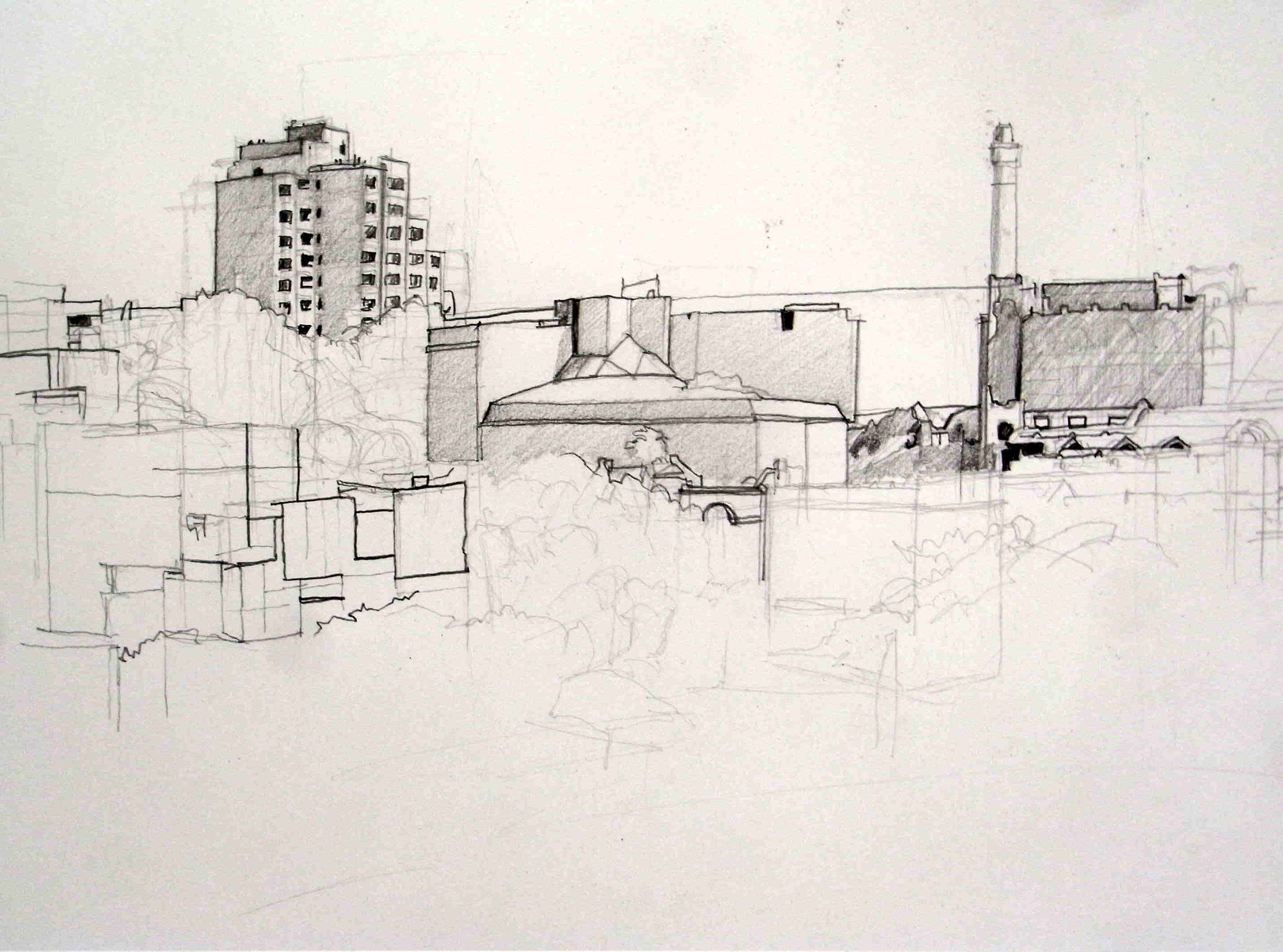
Mitsubishi H and 4B pencil on A2 cartridge paper 110gsm
Another sunny morning with strong cast shadows, so an opportunity to good to pass up to go back to The Rocks in Sydney where I drew this view earlier this week. Today, instead of drawing ‘freehand’ without any careful or comparative measurement as I progressed, I aimed today for a more ‘correct’ drawing, for careful representation of the ‘boxes’ in the environment and an acknowledgement of shadows.
The focus of the sketch is the Sirius building, an example of Brutalist architecture, examples of which in Sydney are being disguised and their strong features softened these days, or, in the case of Sirius, likely to be demolished and sold off for luxury apartments. I’ve consciously included windows in the Sirius because it is the last large building in the area to house residents, the other buildings being offices, hotels and in the case of lower left, the Museum of Contemporary Art annexe. Drawing is a political act and this was an ideal opportunity to provide commentary on the rapacious actions of the super-rich in Sydney destroying the lives of the poor. That community housing will be better off by the building being sold is of course fallacious and specious: the ends don’t justify the means of dislocating the lives of the most of the vulnerable in the community.
I will leave the inclusion of ocean liners to another day; to draw them exactly would create a sketch which will be too lop-sided to read as realistic.
I took photos of the various ferries coming and going from Circular Quay below and they will make interesting studies in gouache for a later date.
Daily Drawing – Westconnex 6feb18
February 6, 2018
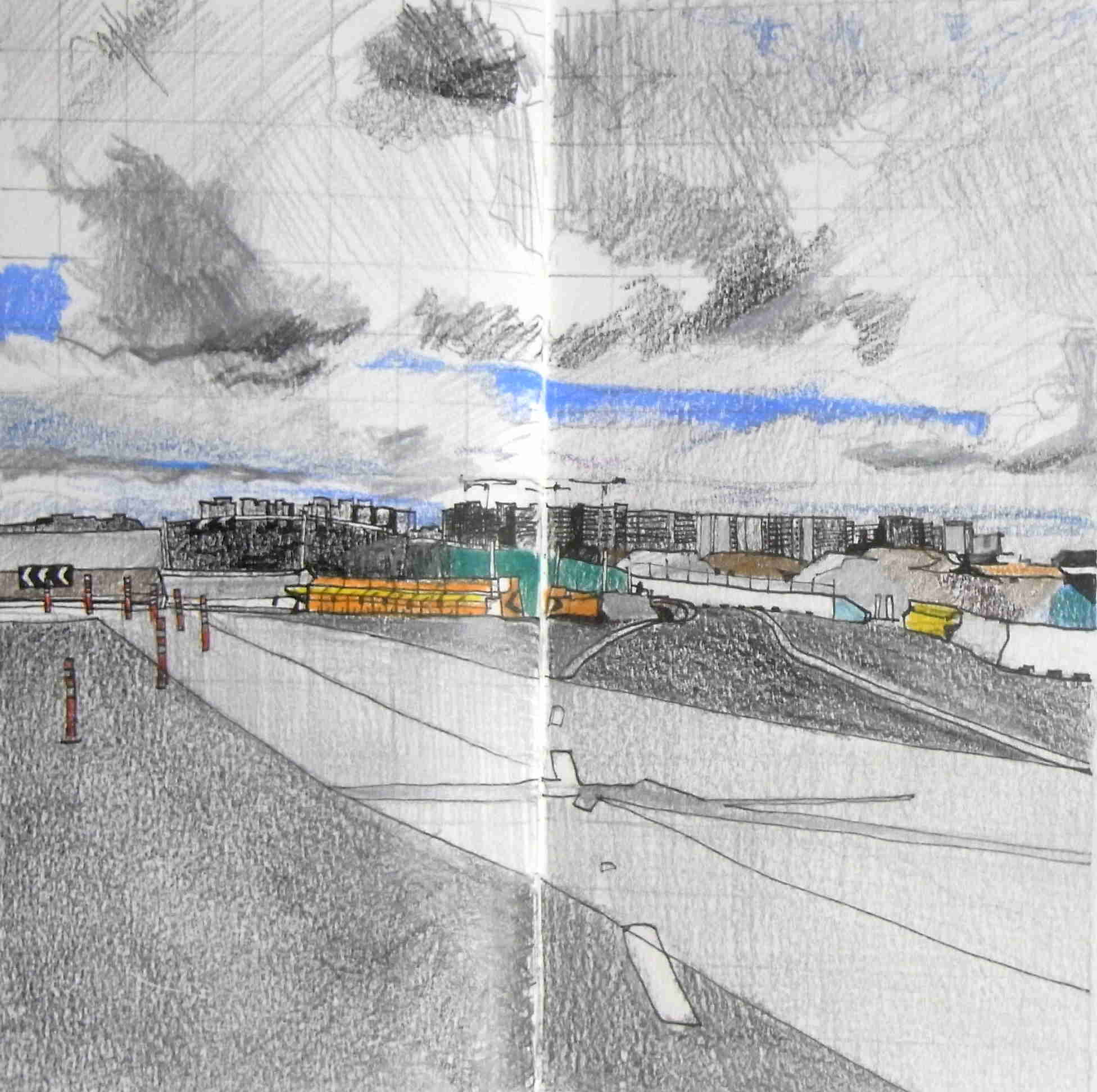
Mascot panorama, 8″ square, Venezia Sketchbook Fabriano Accademia 200gsm; Sakura micron 0.5mm fineliner; Polychromos oil-based coloured pencils.
Over the years, I’ve been threatened while out location drawing at building sites into discontinuing a sketch by security guards and building/construction personnel, despite always working on public property. The law is on my side, but it’s not worth sketching under the bullying gaze and verbal interrogation of others.
The Westconnex expressway development has seen public protests since its inception so, along with the oppressively hot and humid weather today, I wasn’t going to mix it with the construction workers. Even taking a couple of reference photos for potential drawings was done as unobtrusively as possible.
I was surprised to accidentally come across this panorama of the burgeoning apartment blocks around the new metro station of Mascot in the distance. I remember when Mascot property was light industrial, with the smell of horse knackery by night. Nowadays haute couture boutique shops and luxury car showrooms have taken their place.
Apart from exploiting natural direction lines, this is a routinely-challenging square format. Making it into a rectangle would eliminate the white road markings as well as the dramatic sky. And yes, I realise it’s a cliche-looking Jeffrey Smart composition. I need to spend more time ‘skying’, as John Constable called it – drawing skies and clouds.
Use of coloured pencil with waterproof pen (as championed by James Richards, for example) is a natural extension on my pen-alone work yesterday. I love the way that in Richards’ drawings, the coloured pencil calms the overly-strong black-and-white penwork and how his very sketchy use of pencil, rather than block areas of colour, works like tinting an engraving.
Daily Drawing – 90mins 5feb18
February 5, 2018
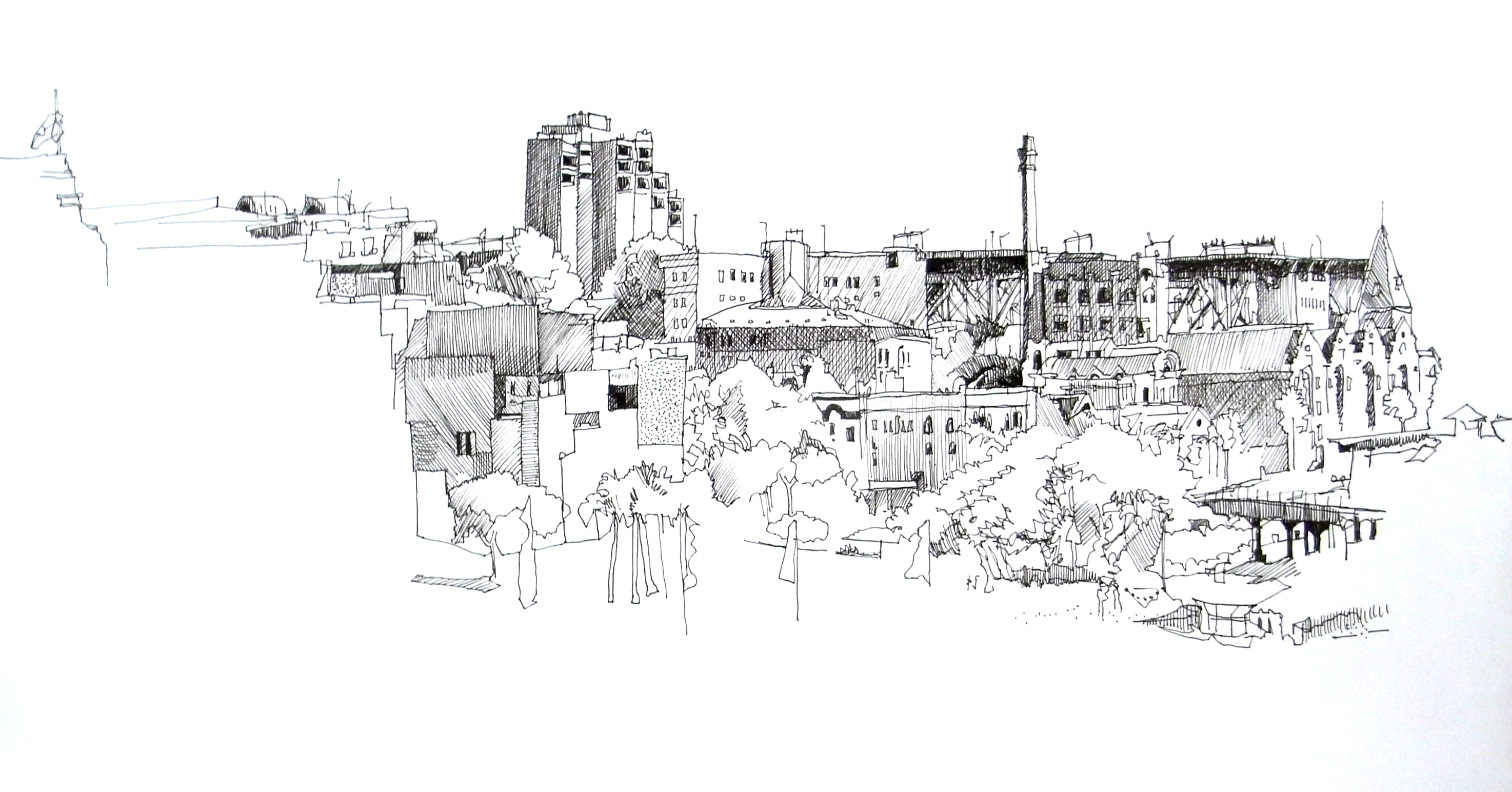
Sakura Micron 0.5mm fineliner on A2 cartridge
The Rocks, Sydney
Working alla prima with no pencil underlay and with no forethought about geometrical foundation, I worked from right to left initially in contour, then in a combination of tone and cross-hatching. The line wasn’t as fluid or loose as I’d anticipated and I’m re-learning a lot about the subtlety of cross-hatching. I’m surprised how little my penwork has changed over the last five years: the ‘signature’ is firmly in place.
Happily, I worked under shelter and with a ‘found’ easel and in a setting almost devoid of distractions. High up on the viewing platform on the Cahill Expressway overlooking Circular Quay, I had barely a handful of visitors – best of all was not having to hold or handle the paper while working. Sydney Sketch Club worked this venue recently and visited the doomed Sirius building (left) from the Brutalist era. Not conveyed here with any deftness are the striking contrasts in architecture: from the Australia Navigation Company building far right, to the modernist hotel centre and the new Museum of Contemporary Art annexe left. The shadows got more defined in the last hour of the drawing, 10.30-11.30am, though their geometrical shapes were more interesting in the half-hour before that. I liked adding the indigenous flag far left.
I hope to return to this location soon.
Daily Drawing – Pen & ink – 2feb18
February 2, 2018
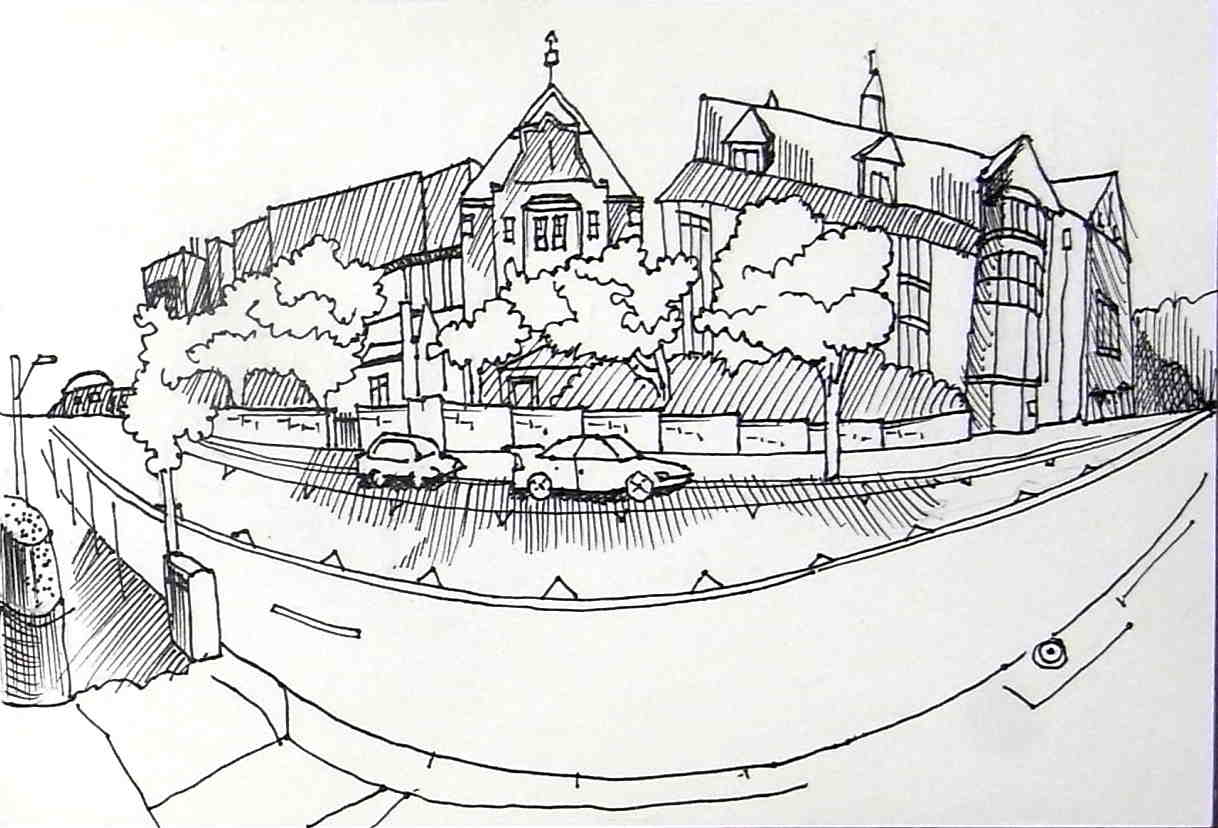
Pen on paper – Faber-Castell PITT artist pen Black #199 F; MontMarte sketching journal 5.5×8.5″.
Summer holidays means playing with materials. This cross-hatching pen style reminds me of Robert Crumb.
Strengths. A very pleasant session observing reality! Extremely quick and very easy sketching method, almost too effortless. I was aware of contrasting textures: stone, tin, brick, bitumen, clipped hedge. I followed the concept of fish-eye/wide-angle reasonably well. There’s an understanding here of how much to economise subject matter in order to fit it on the page. Cheap paper = useful for practising both the wide-angle concept till it feels as natural as more usual linear perspective and tonal values/texture through cross-hatching till it becomes more automatic.
Weaknesses. The uppermost perspective lines are somewhat insecure; the bottom right-hand corner needs to balance up the left.
Opportunities. Location/Light and Shade. Try doing something like facing south next time – today, I was drawing into heavy shade throughout. The natural environment. Choose a less demanding subject next time – minimise use of trees next time – there were rather too many of them today and I only included a fraction of them.Keep working on the silhouettes of trees! Tools. The paper needs to be a tad smoother, though there is no bleed-through, so it’s possible to do another complete drawing on the back. Given the small size of the page, go for an Extra Fine pen next time. In fact, work through all your fine-pointed pens to see if any of them both suit the paper and suit the size of the drawing. Once all the pens have been tested, use this concept in pencil and see how it works with colour. Texture. Cultivate a variety of surface texture next time or at least know how to render it – the shrubs are rendered in the same manner as steel building facades.
Threats. Don’t stick to pen with this concept – incorporate into pencil drawing and even colour. Watch the dark darks – they tend to draw the eye!
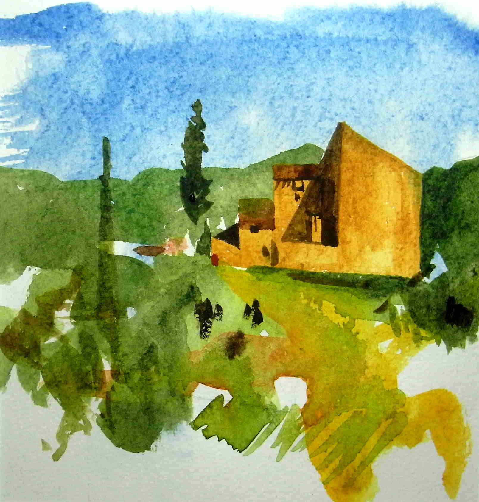
Daily Drawing – watercolour 31jan18
January 31, 2018
DS watercolour paints on Moleskine Folio Watercolour; Rosemary #2 brush; 15.75x15cm.
A second copy of Albany Wiseman’s Derelict Farmhouse in his The Artist’s Sketchbook (London, David & Charles, 2002, p.51).
Several conclusions:
- sky: wet-on-dry today: I have to attribute the hard edges to the paper and its sizing (I’ve suspected all along that Wiseman used 300gsm for this study); mine has more granulation;
- I’ve used DS Sap Green almost exclusively today: the background hills are ‘pure’ and everything else involves a mix with that green; the foreground would be improved with the granulation provided by DS Potters Pink;
- I’m more certain today that he uses a cooler green than my DS Sap Green (Wiseman’s hills are much more convincing than mine as a consequence) – but I’m not obsessing over trying to replicate the exact colour so much as imitating the brushstrokes;
- I am pleased with the transparency of washes sufficiently ‘watery’ to show pencil lines; however it’s obvious from the ‘beads’ he’s left in the foreground, they could possibly have been more ‘watery’ still;
- there’s much more work to do with improving the visual interest of the mid-ground and I think one way of imagining that a little better would be do a pencil drawing of the entire scene, adding what I think Wiseman might have seen only to have subtracted it in his watercolour;
- I keep seeing new things, despite having gone over the original book illustration of 10cm square – I’m today seeing blue lines as ‘window sills’ and – !@#$ – two tiny people;
- I used a Rosemary #2 brush exclusively today and I’m more convinced than ever that a much smaller brush was used for the details.
Yesterday’s is plainly much more vibrant than today’s and it was interesting to move to more ‘watery’ washes to compensate. To give my brushstrokes a bit more ‘direction’, I’ll go for a separate pencil drawing to create imagined details in the mid-ground and try out a rougher paper. Fascinating!
Daily Drawing – watercolour – 30jan18
January 30, 2018
DS Watercolour paint in Moleskine Folio Watercolour sketchbook, 15.75x15cm.
I’m carefully adopting a traditional studio approach to watercolour before going outdoors. That involves deciding on tube paint, the texture of the washes, the order of work, which colours were mixed on the palette and which mixed on paper and being very strict about assessing drying times.
I’m going through all my books for simple watercolour sketches I can copy, more to compare brushstrokes and strengths of washes than matching them colour-for-colour.
Copying means I can get into the artist’s head seeing how they used what technique to what effect. The current subject appeals because it very plainly uses ‘watery’, ‘juicy’ and ‘pasty’ washes in combination. A variety of mark-making is evident, as is materiality: backruns and colours mixing on the paper, the “superpowers” of watercolour.
Today’s is a copy of Derelict Farmhouse, in Albany Wiseman’s The Artist’s Sketchbook (London, David & Charles, 2002, p.95).
Behind the white paper mount around my drawing are my colour notes and order of work: 1. pencil lay-in (little more than a dozen lines); 2. Sky: what looked like a juicy wash on wet paper in cerulean (and actually descends right through to foreground on the left and down the building on the right); 3. Building first layer, with water added for watery wash towards foreground; 4. Background hills: juicy wash in Sap Green and more watery wash in foreground with addition of yellow; 5. Dark highlights (Van Dyck Brown) moving to more watery for building shadow; 6. Scarlet highlight with additional more watery dashes to its left.
Conclusions:
- tonally darker than the original, which is a natural consequence of preferring ‘juicy’ washes over ‘watery’ ones;
- I suspect the paper wasn’t pre-wetted at all for the sky, for example – try a ‘juicy’ wash on dry paper (and if still too strong, go for my routine ‘watery’ wash);
- go even bigger: published it was 10x10cm, but I suspect from the smallest brushstrokes that the original was probably twice the published size, not 75% in today’s – either that change to a much smaller brush for all the brushed lines;.
- .using ‘juicy’ washes virtually eliminated all pencil marks – try again with my more routine ‘watery’ washes.
On a personal note, I love the summer break for experimenting. Yes, there is the ‘shock of the new’ but it’s great to play before going back into the studio proper to tackle the year’s body of work.
Montezuma Quail – gouache, watercolour, pen, coloured pencil
January 29, 2018
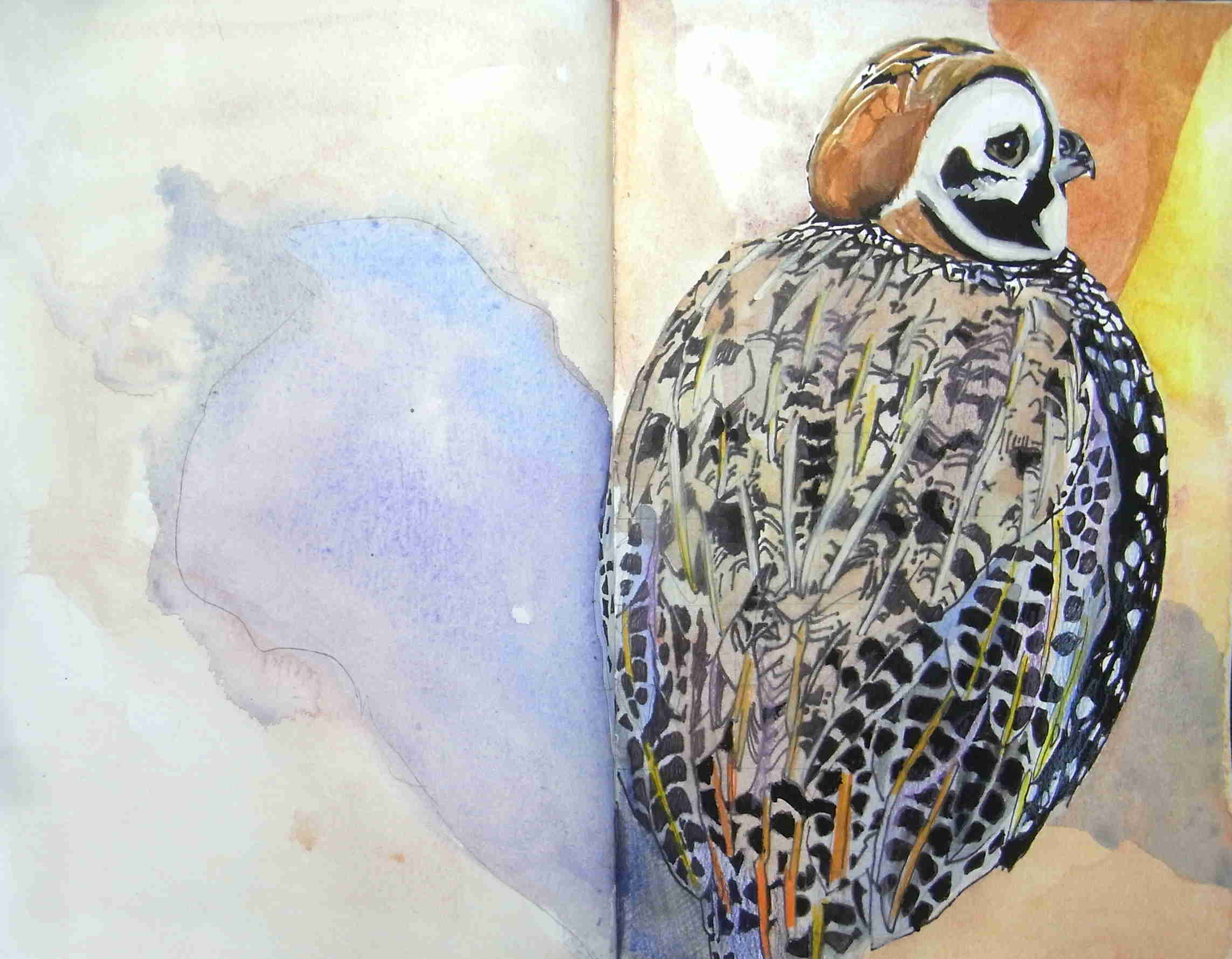
Venezia Sketchook 9×6″; Fabriano Accademia 200gsm; Faber-Castell artist pen; DS watercolour paints; W&N gouache, Prismacolor coloured pencils.
- to add the feet, or not add the feet;
- watercolour over pen dulls the black (but the scale is too small to show the colour effects of overlapping translucent feathers);
- laying down watercolour then over-painting with gouache for stronger darks;
- realistic pattern, or suggestion of pattern;
- conceding to bird enthusiasts: differentiating between different feather types in the wings – rather like the ‘secret code’ of defining boney landmarks in figure drawing (whether they are actually visible or not);
- watercolour and gutters (!);
- format size – need to work larger and more freely (ready to upgrade to an 8×11″ Strathmore 500 Series Mixed Media journal – ostensibly for gouache (and extras), while Moleskine Folio Watercolour works for watercolour proper);
- since I’m not American, there is an enjoyable (cultural) ‘distance’ between me and the subject – an entirely different proposition if it was an Australian bird;
- the splendid ‘artificiality’ of bird portraits made many times bigger than life-size;
- absolutely no intention of mirroring reality – nature photography does that: no, my bird portraits are self-portraits of the artist.
