AGNSW The Greats (National Scottish Collections) – Gauguin
December 25, 2015
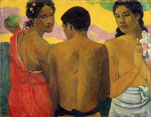
Paul Gauguin, Three Tahitians 1889, oil on canvas
- unfortunate gallery lighting causing interference along the top edge;
- the prominent black scar on the male’s back (“marked man”), highlighted with yellow ochre;
- black outline of the figures (Renaissance);
- one-colour treatment of each of the figures’ clothing (Renaissance);
- contrast between Vice and Virtue: surrounding negative space;
- curious anatomy in the face of Virtue, especially the eyes (compared to Vice’s);
- the uncomfortably cramped flowers of Virtue (echoed though in the hair of Vice);
- the contour of each of the women’s shoulders continues through the form of the male, providing a very strong sense of unity between the three;
- the curious light on the male’s buttock below his belt;
- the echoing of the knotting in each of the figures’ clothing;
- all the colours of the palette – blue, mauve, red, orange, yellow, green – suggesting universality and completeness;
- the awkward use of the hand holding the green mango – I can’t find a precedent in Western art for this pose beyond Raphael’s Three Graces;
- echoing touches of pink under both the women’s ears;
- lack of complicity – none of the figures is looking directly at each other;
- close cropping in the Japanese style;
- heavy, smearing application of paint;
- both women are taller than the male;
- problematic anatomy of Virtue: the position of the breasts suggesting she’s turning, though that turn is not reinforced elsewhere; both breasts appear to have been deliberately lowered, perhaps to disguise one behind the forearm to denote modesty;
- curious use of the tricolore in the clothing of the figures – conscious/unconscious cultural fusing?
- Virtue as mahu and a commentary on the impact of colonialism through a Western gender binary system, not just as the male turning from the mahu to female, but the Western iconography of Adam/Eve and the fruit of the Tree of Knowledge?
Some digital reproductions of the painting on the internet crop the expansive dark green landscape at far left and below the man’s loincloth. Digital reproductions of Vice’s red dress vary the colour from orange to warm red, cool red crimson, Indian Red and dark pink.
Regarding the troubling anatomy of Virtue, see the discussion of mahu at http://www.sea.edu/spice_atlas/tahiti_atlas/paul_gauguin_primitivist_art_and_the_invention_of_polynesian_sexuality
Daily Painting Challenge, January 2015, collage
January 31, 2015

It’s 1 February local time, so using PicMonkey (ipiccy is equally good), I’ve created this collage of paintings completed during January as part of the online final day celebration.
Sincere thanks to those who’ve dropped by my weblog; your interest has been motivational and inspiring. Thanks also to Leslie Saeta for organising the Thirty Paintings in Thirty Days, January 2015 challenge (http://lesliesaeta.blogspot.com.au), to Carol for alerting me to the event and to colleagues, all 1483 of them from around the globe, who’ve been a part of the event!
Daily Painting Challenge, January 2015, Day 28
January 31, 2015

Red onion
oil on canvas panel, 6×6″
At this stage of the Daily Painting challenge, Thirty Paintings in Thirty Days, I’ve completely lost the sequence of paintings and days. I date the back of each canvas panel and refer to the previous painting rather than the date on my weblog or the date on Leslie Saeta’s weblog. The differences in time zones between the US are huge; the automatic dates on my blogs generated by WordPress are different from my own timezone; Leslie allows extra time for paintings to be uploaded. I know I lost a day or two last week because of a death in the family and some heat stress because of the weather, but the method underpinning each painting is improving day by day and frankly if I’m painting every day, I don’t really care whose sequence I feel I need to fall in with!
I was so “fluent” with the process today that I was able to stop and take some sequential photos.

This dramatic red onion allows me to play around with my tubes of violet paint. Having three, sometimes four, separate colours for red, blue, green, yellow, purple helps.
The underdrawing has to include some of the major tonal areas of the subject. I’m considering big colour changes as well as big tonal changes. I’m concentrating on the contours of the figure against the ground, especially where they count: the light against the dark back wall. I’m not focussing on detail; this is not a Drawing.

The next step is acrylic underpainting in complementary opposites. Invariably, I will lay out red, blue and yellow acrylics and mix from there. It’s a good sign if I am using all three. Mainly to confirm that I’m on the right track with how the figure is in relation to the ground. I could do this in oils of course, or I could do a tonal background using a Van Dyke brown. But this is Fast Painting, not Slow Painting. My 6×6″ canvas panel (tripled primed in white gesso) is being supported on a 8×10″ canvas panel, still wrapped in its plastic. I could Bluetack it to the plastic, I suppose, but this support is enough to keep my fingers away from the edges of the painting.

By rights, if I were to strictly follow Arthur Stern, I’d lay out and mix all colours before going anywhere near the canvas. But I tend to work the three areas separately: back wall, floor, then object. Sometimes I fill up two 10×12″ palettes with my mixes, but in this painting I filled up only one.
Sometimes I will take a break to clean the palette in the middle of my painting session. I don’t clean my palette completely; since this is a wooden one, I simply scrape off any excess and then rub the remainder back in to the “grey” of the palette.
I put the acrylic underpainting in the sun to dry for five minutes and use the time to lay out my tubes of paint. I may add bits of other colours from different tubes, but I know in advance that these are the ones I will rely on almost exclusively for this particular painting: Titanium White since there’s a lot of white and light tints; Ultramarine Blue and Burnt Sienna and a pinkish grey (Australian Grey), since the back wall is a blueish-grey; a range of Yellows for the floor; a range of Purples for the onion. The root section of this particular onion is a rich chocolate brown, so I’ve whipped out my Yellow Ochre and Van Dyke Brown for this special effect.

I’m invariably these days starting with the back wall and here’s how it looks with the palette. I’m resting the painting in my lap on the palette; I’m working outdoors in shade. In a more sophisticated setup, I might have the panel on the strictly vertical on an easel, adjacent to the subject; I’d step back two metres to make my decisions and then move in to add paint. My domestic workspace doesn’t allow for such sophistication! Knowing how much paint to put out has become easier after four weeks; it comes with practice and these days there’s hardly any paint left to scrape off. I leave the blue and brown on the palette because I know I’ll use them for the darkest areas of the onion.

Here’s the floor done and I’ve started jumping into the onion already. I’m not entirely happy with either the back wall or the floor, but I keep moving forward. I know I could spend days on both in order to get them 100% to my liking.
Here’s the onion proper finished. I stop when I’m really starting to fuss over some of the colours and definition of geometric shapes. Despite it starting to turn into a mud pie, I can walk away knowing I’ve got down most of the colours I observed and was faithful to most of the geometric shapes I observed.
Thirty Paintings in Thirty Days, January 2015, organised by Leslie Saeta (http://lesliesaeta.blogspot.com.au).
Reference: Stern, Arthur. How to see color and paint it: a series of projects designed to open your eyes to colors you never saw before. New York, Watson-Guptill, 1984.
Daily Painting Challenge, January 2015, Day 27
January 31, 2015

Brown onion
oil on canvas panel, 6×6″
Graphite underdrawing (hard pencil, not soft!), followed by acrylic underpainting in complementary opposites (red for back wall, green for floor, purple for onion). Normally I try to preserve as much of the foundation drawing as I can. The acrylic underpainting eliminates the white canvas and allows me to re-assess the relationship between figure and ground. The acrylic underpainting never looks “beautiful”, nor should it: it’s simply there to establish a reasonable-looking blob of a figure against a ground. In this particular case today, I reduced the size of the onion considerably when I started painting it in oils. The capsicum I painted a few days ago suffered from being overly big for the space it contained.
I include the geometry of the main tonal areas in my underdrawing, but most of the attention goes to the contour of the upper half of the subject. What will make it “read” as an onion is the roots at the bottom (here on top) and the shoots at the top (here at bottom right).
I keep the paint on the back wall as thin and sketchy as I can. I am not averse to the ground showing through and if any serendipitous palette knife strokes seem okay, I will leave them rather than constantly working over the top of them. I don’t paint the entire back wall in a single colour any more. I start with the darkest areas and then progress by making subtle changes in lightness and darkness, and colour. Each colour spot really only amounts to a palette knife stroke or three.
I ever so slightly exaggerate everything: the contours and the colours. The photograph below doesn’t do justice to the range of colour in the onion skin layers, or to their broken edges. The area most prone to overworking is, of course, the shadow at the base of the subject.
If I wanted to amaze Sydney with my onions (just as Cezanne wanted to amaze Paris with his apples), I’d work much more deliberately and less spontaneously.
Only by looking at the photograph AFTER the event do I notice a fundamental error in my painting: the roots are not directly opposite the shoots.

Daily Painting Challenge, January 2015, Day 26
January 30, 2015

Prickly Pear
oil on canvas panel, 6×6″
Ordinarily a horticultural pest, Prickly Pear fruit only comes my way every few years. I’ve drawn them in the past; I love their subtle greens and purples. It’s been so long since I last saw them, I’ve forgotten how to eat them and what they taste like. I did make a terrible mistake today however: I arranged them on a white plate with my bare hands. Having done so, I picked up microscopic spines all over my fingers. Today’s was thus painted on tenterhooks, a painful jab at every inopportune moment. The fruit would have been “unreadable” as Prickly Pear without the final dots.

My painting ‘pace’ is improving, but still a bit rocky and wayward: either the colour is right and the tone is wrong, or vice-versa. The natural light changed significantly during the two hours: the most in any of my daily paintings this month.

It felt strange to pick up a brush for the underpainting, today done in complementary opposites but in more than few colour spots.

And I thought I’d photograph my palette, for no particular reason, except that there’s too little paint to create colour palette samples on canvaspaper and I’m a long way from recording colour samples as I work, which is something of a lost opportunity. Normally I’d clean the entire palette twice during the session, but today I got away with a (messy) once.
Daily Painting Challenge, January 2015, Day 25
January 28, 2015

Capsicum
oil on canvas panel, 6×6″
Preliminary drawing of major masses, followed by ground/underpainting in tints of Pthalo Green acrylic, so I could retain the major masses. The ground/underpainting certainly eliminates any concern about the canvas texture affecting tone. For example, laying down Ultramarine Blue brings out the plain white canvas texture.
They say a habit becomes permanent after doing it for 21 days and today had a feeling of ‘having-done-it-all-before’. Not complacency, since close observation requires the utmost focus, but no stress. I’m reaching for the required paint tubes automatically. I know when my lapses in tonal matching are most likely to occur and I’m acutely aware of how the consistency of paint can affect its application, mainly arising from the fact that Titanium White (and in my case Spectrum Red Dark) are of a tougher consistency than the other tube paints. The hand wants continuity in paint application, so getting the consistency of paint is important in supporting that continuity.
In the back of my mind is the need to tackle transparency and fairly soon I’ll tackle a tumbler full of water: Diebenkorn’s knife and glass of water come to mind. In the back of my mind also is the fact that pomegranites have appeared in local greengrocer’s, a subject particularly suited to oils.
I’m starting to definitely steer clear of any fine detail, preferring large geometric masses instead.
The last few days’ photographs have been marred somewhat by photographing them while still wet. I probably need to wait a day or two for the paint to settle down before taking photographs. It will be interesting to compare today’s shot with one taken in a few days’ time.
Daily Painting Challenge, January 2015, Day 24
January 25, 2015

Marrickville intersection
oil on canvas panel, 8×10″
Today’s was painted not from life, but from a combination of memory, a reference photo and a watercolour sketch done on location. Curiously, it’s closer in gesture and feel to the original play of light on the subject than the watercolor. It renders accurately what I saw at the time. I’m aware of pumping up tone and colour, especially in the light of the comments by Cezanne and Van Gogh I’ve been reading lately.
I ended up using only five paints (Ultramarine Blue, (warm pink Art Spectrum) Australian Grey, Burnt Sienna, (Art Spectrum) Coral and Titanium White) so it theoretically could have been done plein air after all. I had managed to tuck myself out of direct sunlight, propped up against a telephone box; the shadows start to get interesting around midday.
I’ve been painting my still lifes early in the morning and spending the rest of the day thinking about it. I wonder if 100m athletes do the same. I’d return to paint again in the afternoon, but I’m too exhausted. I find myself accepting the happy accidents which turned out well, but am equally perturbed by effects which I believe mar the whole. Because I know there is going to be a huge disparity between happy accidents and unfortunate ones, I work quickly to “block out” any judgement while painting. One simply observes and hopes for the best, leaving alone what doesn’t need fixing. The decision-making process while painting is frenetic, because if I give each decision its appropriate time, I will never get the painting done. Each painting becomes a two-hour session of intense observation.
I resign myself to the fact that once the two-hour session is over, it’s gone forever. Even if I had a fixed indoor shadow box setup instead of working in natural daylight, would things change, I wonder? To observe a second time means a quite different painting outcome, hence Arthur Stern’s insistence on at least three separate ‘statements’, scraping off between each one. The issue of re-working and re-touching work was well covered in the podcast by Carol Marine at http://savvypainter.com; time being such a precious commodity, it’s better to move on than endlessly correct.
Exhausting too are the “accidents”. Ultimately the “accidents” make or break the painting for me. Carol insists on being proud of her work before she puts it into the public domain. I put everything in the public domain because I can’t differentiate between what is “good” and what is “bad”. Inevitably, a work I am most proud of gets ignored; everyone raves about a work I feel has failed. Working in a sketchbook means that failures have to be accepted along with successes; they sit physically beside each other. I find Carol’s annual “art destruction” parties curious, those regular occasions when she will destroy her bad work. How does she know which are “good” or “bad”? Being “proud” of a work is surely more about resolving personal aesthetic problems and less about whether it will please others?
But on the subject of “accidents” and palette knife technique as a whole, creating “mud pies” and knowing when to stop, I identify very strongly with Francis Bacon. Here are excerpts from an interview he gave with David Sylvester in the Sunday Times Magazine (London), 14 July 1963, pp. 13-18 and reproduced in Herschell Chipp’s anthology, pp.621-622. He describes exactly what I’m experiencing at the moment.
Bacon: You know in my case all painting is an accident. I foresee it and yet I hardly every carry it out as I foresee it. It transforms itself by the actual paint. I don’t in fact know very often what the paint will do and it does many things which are very much better than I could make it do. Perhaps one could say it’s not an accident, because it becomes a selective process what part of the accident one chooses to preserve… The way I work is accidental and becomes more and more accidental. How can I re-create an accident? Another accident would never be quite the same. This is the thing that can only happen with oil paint, because it so subtle that one tone, one piece of paint, that moves one thing into another completely changes the implications of the image.
Sylvester: If you were to go on, you wouldn’t get back what you’d lost, but you might get something else. Now why do you tend to destroy rather than to work on? Why do you prefer to begin on another canvas than to work on?
Bacon: Because sometimes then it disappears completely and the canvas becomes clogged, there’s too much paint on it; just a technical thing and one can’t go on.
Sylvester: Is it because of the particular texture of the paint?
Bacon: I work between thick and thin paint. Parts of it are very thin, and parts of it are very thick. And it just becomes clogged, and then you start to put on illustrational paint.
Reference
Chipp, Herschell. Theories of Modern Art: a source book by artists and critics. Berkeley, Univ California Press, 1968.
Daily Painting Challenge, January 2015, Day 23
January 24, 2015

watercolour on 240gsm paper
Because of the extreme mid-summer heat currently, I’ve found it difficult to do anything in addition to, or other than, a daily painting. Indoors the temperature creeps up to around 40 degrees Centigrade. I can only assume daily painters work in climate-controlled studios, because my physical limit is around 35. No work today.
With a lull in the heat yesterday, I was however able to do some urban sketching outdoors. Also, yesterday’s compilation of the last nine days’ work made me realize I’d been concentrating on surfaces – shiny, transparent, translucent. These nine-day collages are becoming psychological watersheds, allowing me to pause momentarily, mainly to check that I’m moving right around the colour palette. The bright colours are disconcerting for me personally, but colour mixing is a valuable experimentation.

I’ve not done any plein air painting of late, and so while the heat continues, I’m anticipating a change from still lifes to landscapes using photographs as their starting point. Photographs because often for me the most interesting landscapes are impossible to draw or paint in situ.
While totally unhappy with yesterday’s watercolor, it hasn’t dampened my enthusiasm for tackling urban landscapes from now till the end of the month.
I listened to Carol Marine’s podcast on http://savvy.painter.com. I’ve gone ahead and ordered her book, Daily Painting, mainly in the hope that I’ll discover how she factors in paint drying, post-painting glazes and picture varnish (and their respective drying times). I assume long drying times are factored into the timing of blogposts and online sales, for her and for others. Personally, there would have to be a hiatus of several months between painting and final picture varnish.
Daily Painting Challenge, January 2015, Day 22
January 23, 2015

Metal bells
oil on canvas panel, 6×6″
Project 11 in Arthur Stern’s book on colour mixing concerns metal surfaces. For months now, I have been taking note of glass, metal and cloth in the still life paintings of 17th-century Dutch painter, Pieter Claesz. I’m at the point where copying his work will improve my sense of composition and appreciation of surfaces, shadows and reflections.
Thirty Paintings in Thirty Days, January 2015, organised by Leslie Saeta (http://lesliesaeta.blogspot.com.au).
Reference: Stern, Arthur. How to see color and paint it: a series of projects designed to open your eyes to colors you never saw before. New York, Watson-Guptill, 1984.
Daily Painting Challenge, January 2015, Day 21
January 22, 2015

Seashell
oil on canvas panel, 6×6″
I am re-visiting seashells today and wanted a composition which would easily “read” as a seashell. This miniature “conch” (a mere 2.5 inches long) brought to mind the shell painting in Arthur Stern’s book so I adopted the blue wall in back on a yellow floor. It’s chipped in several places; but Gauguin, who I’m reading today, says that Nature is over-rated and working from imagination is more authentic. “Art is abstraction”, he says. The cloisonné approach to colour – stained glass was something many were aiming for at that time – has a close fit with the jewel-like aesthetic of Arthur Stern.
Today’s learning component involved underpainting in acrylic, in the complementary opposite. The dark blue was painted over orange; the yellow over a purple (more a Prussian Blue than a proper spectrum violet). I worked outdoors, in shade, but it was so hot, the acrylic dried almost as soon as it was mixed on the palette. I applied the acrylic with a palette knife and the overall effect was immediately graphic and illustrationist, compared to the much more “variable” oil paint.
I am deliberately making the back walls as “flat” as possible, to increase aerial perspective, with a minimum of impasto, texture and strong difference between colour spots.
I am reading the Chipp anthology including letters written by Cézanne, Van Gogh and Gauguin on their practice, in particular their approach to working from Nature and tacking colour. Their words (and the work of painters like Adolphe Monticelli) are convincing me I’ m personally not taking a wrong turn. The French for “taking a wrong turn” is “le mauvais virage”or “le mauvais sens”, where “mauvais” usually means “bad”. A “bad” direction sums up exactly how I’ve been feeling lately about Fast Painting.

I know of some artists who spend hours on getting the right composition. I took this to heart today, in a very limited fashion, by taking a dozen photos of the seashell in various positions. What the photos highlight is the blue tones in the shell, foreground blue well away from the back wall.
I’m acutely aware that on my return to Art School classes this time next month, I’ll be returning to Slow Painting: much more considered composition, preparatory drawings, lost and found brush strokes.
Thirty Paintings in Thirty Days, January 2015, organised by Leslie Saeta (http://lesliesaeta.blogspot.com.au).
References
Chipp, Herschel B. Theories of Modern Art: a source book by artists and critics. Univ.Calif.Pr., 1968.
Stern, Arthur. How to see color and paint it: a series of projects designed to open your eyes to colors you never saw before. New York, Watson-Guptill, 1984.
