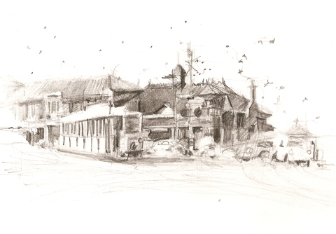
Newtown Railway Station 1910
August 11, 2012
5×8″ 4B pencil on 220g multimedia card.
Anticipating a return soon to draw Newtown Railway Station because of the current building work going on there: a dramatic new station entrance via the south on the land previously used as tram sheds.
In addition, on a Sydney Sketch Club meetup at the Australian Maritime Museum, I remembered that a switching box once graced the Railway Station, identical to the one sitting on Pyrmont Bridge.
Thirdly, I need to draw some former Sydney trams at the Tram Museum, Loftus. (The dots in the air are tram wire connection points.)
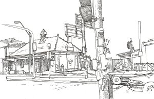
Pen sketch from my own photo, Oct 2011 (taken from outside the cafe between King St South and Enmore Rd)
That today’s is a sketch of the railway station, the Bank Hotel (to the left) and/or a sketch of a Sydney tram, underlines a quote from Meglin:
“…a photograph locks in a moment of life “factually”. A drawing locks in that moment “expressively”.”
I like very much portraying the ‘factuality’ of buildings, especially when buildings can look so generic that they can be from anywhere in the world. But ‘expressivity’ reigns, almost two centuries now since it took over from ‘realism’ in Western art. Can’t buck the trend. The original photo creates two focal points for the sketcher; I’ll see how I go on location.
Sketching Sydney – Chatswood NSW
August 10, 2012
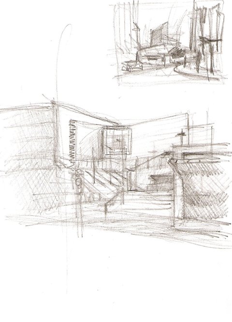
Still a slave to habit, but lots of new ideas are at work in my head, even if I’m slow to put them into practice. The smaller 4×6″ sketchbook is for when I’m not carrying a bag – “opportunistic” as opposed to “planned” urban sketching.
Took a very quick detour to take in the new Performing Arts Centre, which I’d read about recently. It occupied a much larger space than I was anticipating, fronting directly on to Victoria Road in part. Obviously I need to go back and study its veils of white walls more closely and from different angles. Checking out the concert hall interior would be fun too. Parts of Victoria Road closer to the railway station have very good public seating for drawing people (coming to you obliquely for quite a distance) and the footpath is wide enough in places to draw the outdoor mall scene with food sellers, especially from outside vacant shopfronts) but my particular angle here was a bit difficult footpath-wise. 2-3mins max.; I was expected elsewhere.
Later on, outside the Chinese cake shop in Orchard Road looking across to Help Street (and the restored railway building rendered helpless and in miniature by the soaring towers all around), I stuck to the Veronica Lawlor principle of thumbnails (but not so quick as to not go back for tonal values). Again, very rushed – on the way to somewhere else. The restored railway building (far left) would have formed a second conflicting focal point, so at least I’m clearer about what to come back and look at next time. I’d better be quick though, this is another high-rise tower going up over the railway track, symbolic of the huge architectural changes going on here in recent times. Interestingly, the heavily ornamented facades of the very few old buildings still standing shine out all the more: the restored Victorian railway building and the 1930s Art Deco pub right at the concourse, in particular.
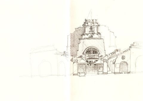
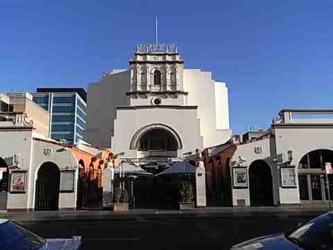
Roxy Parramatta
August 8, 2012
5×8″ Daler-Rowney 150g sketchbook. Pencil. 40mins only, standing up, from 3pm. Parramatta footpaths are blessedly wide; there are in fact several cafes from which to draw this colossus, but a 3/4 view looked too difficult to attempt first off.
The Winter sunset shadows were setting in fast. So fast, I didn’t have time to re-sharpen my pencil. There was some minor re-statement after I’d done the blocking in. One good thing to start with was establishing my eye-line horizon which was at about the lower edge of the white umbrellas. Perspective lines are very clear given the roofs, arches and staircase close to the footpath. Like my Santo Domingo exercises, today’s really rlied on symmetry: what happens on one side must match up (drawn straight away) on the other side.
There are acres of white unadorned stucco-on-brick, contrasting with fairy floss decoration; the horizontal bands across the facade are a brilliant grey and red. Set against a bright cobalt blue sky, it’s a sight to behold! I had to work very fast, working from the top down and the background towards the foreground, thinking all the while of the workshop at the 3rd International Urban Sketchers Symposium which I suspect emphasised a split between foreground and background, emphasised by detail at back and simple line in front. I guess this was aimed at establishing depth of field in urban sketching instead of the ubiquitous flat picture plane – that ‘evenness’ which comes with sketching everything “mid-field”. I started in this direction, but didn’t quite get there.
Around ?3.40pm the shadows to the east started to darken; the dramatic shadows are a late-afternoon phenomenon since the building faces north. The building really deserves at least an hour, if not longer. I’ve visited earlier in the day previously, but the shadows really do provide a good sense of mass and volume. There is tremendous potential for doing small thumbnail-vignettes of some of the architectural detail. You can see this to good effect in the photos of the building at the SydneyArchitecture website: http://www.sydneyarchitecture.com/WES/WES21.htm.
I’ll be back, next time to consolidate a proper line-work foreground and a dramatically detailed background. For the moment, I’m leaving this sketch untouched.
Background
65-69 George Street Parrmatta NSW 2150; Inter-war Spanish Mission style, opened 6 Feb 1930 (Moore & Dyer in association with Herbert & Wilson, architects). My photo accurately shows the three shades from white to dark grey across the main facade.
This is a vast architectural complex: a tower many storeys tall, with white stucco flanks, two extended arms of shops on either side of the entrance, the courtyard full of benches and umbrellas. Currently it’s a theatre, nightclub and pub, with sundry eateries in the courtyard. The building complex is far from being a pristine heritage item, though the paintwork of russet red and steel grey doesn’t appear old. The ‘picture palace’ (I can’t think of another in Sydney of this enormous size) is set back a long way from George Street, with high walls all around. The two ‘arms’ at far right and left form shopping arcades with mock Spanish terracotta rooftiles (1988 refurbishment). The black wooden front gates contrast with the white gateposts; their original iron lightfittings may have gone, but the concrete balls, set in a four-point clasp from below are still there. It used to seat 1,923, making it bigger than the Opera Theatre of the Sydney Opera House. How one gets to see inside the building during the day, I don’t know; I suspect it has been carved up inside so that the original auditorium has been halved (now seats 600), with cinemas in the remaining spaces.
Circular Quay East
August 6, 2012
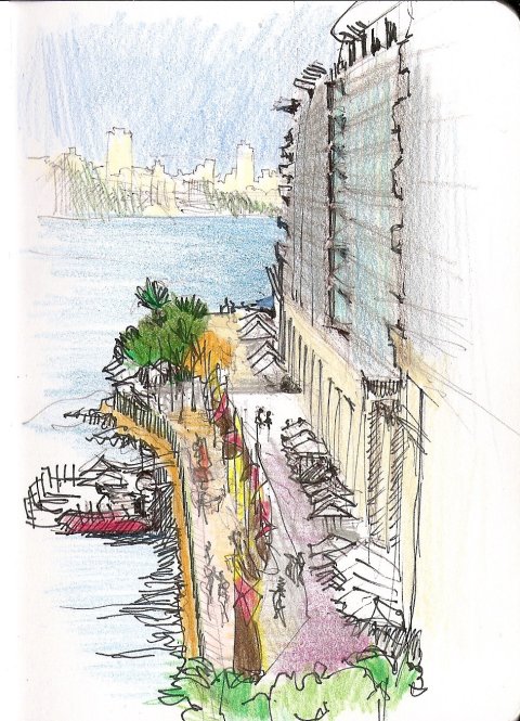
2pm, mid-Winter. 30mins. 5×8″ 200g Daler-Rowney sketchbook.
After a week of armchair urban sketching, venturing Out Into The World today – it’s not scheduled to rain again till Friday.
With just a black biro and an Artliner pen, I thought I’d end up with something looking like a sketch by Luis Ruiz. I had every intention of doing several different thumbnails, but just launched in. Circular Quay East is a very studied piece of urban landscaping and the design elements come into their own when seen from above; it would be ideal for a set of Veronica Lawlor-type thumbnails suggesting a narrative, e.g. since the original 1788 shoreline is etched into the pavement, the contrasting rusticated sandstone of the old steps up to Macquarie Street, the C19 timber-clad building at the end of the road, tourists photographing each other, etc.
This is from the Cahill Expressway, via the lift from the quay proper; I’ve been here before looking for panoramas (but the only potential lies in the west – Goldfields House and neighbours – and the north-west – The Rocks and the Harbour Bridge) but this only works well before noon. Afternoon means the entire Rocks and Bridge are in dark shadow.
A great urban sketcher (Prof. Frank Ching) once said that a good urban sketch is one that teaches. Next time, I’ll realise that all the floors on the buildings at right (1,3 and 5 Macquarie Street, I think) do in fact match from one building to the next. A ‘proper’ drawing would need to take into account also the suggestion of the different materials used – the play of stone, metal and glass is more subtle than when seen from street level. If I was more architecturally-attuned, I would have gotten my eyeline horizon better placed on the first building. The palm trees in various areas of the Quay seem to take their cue from Brett Whiteley’s paintings – a case of Life imitating Art?
This sketch looked terrible till I added colour at home – Prismacolour coloured pencils. I couldn’t remember the exact shades of the tall buildings and while I wanted to suggest depth, the “sunlit” (not) Lower North Shore across the Harbour is not that far away (but at least I retained it in biro and had the good sense not to apply black pen to it).
I must come back again at night, when the open-air restaurants and Opera House crowds make this particularly busy. The only pedestrians up on the Cahill Expressway seem to be joggers.
What I didn’t get to sketch today:
* the Monorail which is slated for demolition;
* the King Street Darrel Lea chocolate shop (the company is no more) – especially since the old Gowings Building is now behind hoardings, being demolished);
* shoppers in Pitt Street viewed from the bridge linking Westfields Sydney Level 2 with the building across the street;
* the positively witchey Queen Anne tower on the Russell Hotel, George Street North (brilliant ochre-and-dark brown paintwork);
* other buildings by Liberty Vernon (the RBG Herbarium, Darlinghurst Fire Station, etc.).
Architecture for Urban Sketchers (4)
July 29, 2012
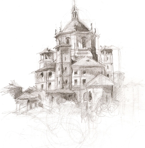
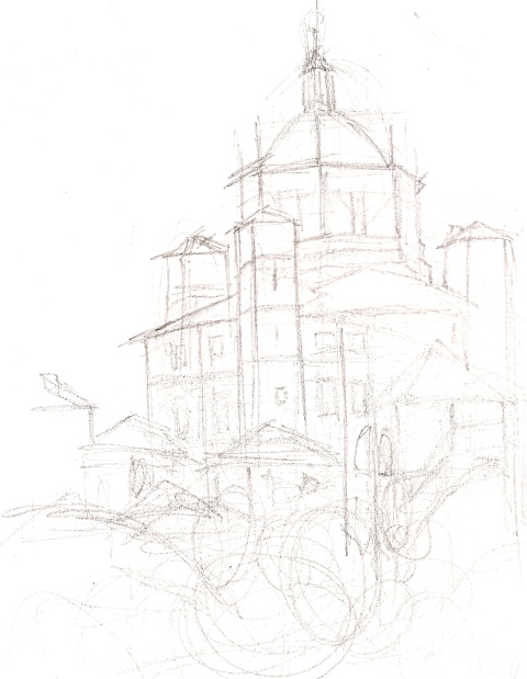
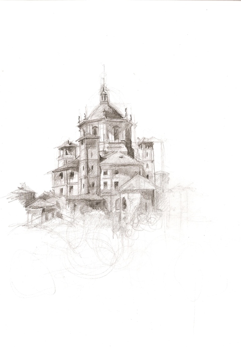
Continuing with the Chiesa San Lorenzo in Milan, I thought I’d step my way through my own process today. I’m not being prescriptive; what I’m looking for is the weaknesses that I tend to bypass or ignore or “speed past” when sketching on location. If I take my time today, working with a photo (and a flatbed scanner) as well as a commentary articulating the inner dialogue along the way, I might see ways of improving what I’m doing.
Materials. I’m playing today, so loose A4 pieces of photocopy paper and Derwent graphite pencils. Construction Lines in light 3B, moving to 5B for firmer detail and tonal values.
Step 1. Construction lines.
Process. Some people draw light lines, others dots. Dots must help because they reduce the amount of graphite or ink on the paper. Because this photo shows the chiesa in light and shadow, I’m consciously drawing the geometric shapes created by the shadows. When it comes to the profile against the sky, I’m very conscious of negative space contour (not the line of the building but the line created by the sky behind it).
I’ve gone with what’s natural for me today – light lines which get darker every time I go back over things. My drawing is often called “sensitive” which is sometimes hard to take as a bloke, but it’s my own doing: I’m constantly re-stating and don’t rub out wrong lines. I’m shown to be struggling with my vision, my regarding the building.
Conclusions. Mood.The building is shooting out from the ground. The building is actually wider (the towers are squatter) but I like the idea of its daring being on show to all. It was the biggest building of its type in the West at the time, so why not show that? Built outside the city walls of Milan on the road to the small town of Pavia, it would have risen straight out of the flat plain of the landscape (the Italian word is pianura). It’s triumphant, unprotected by the city walls – it dares to be sacked by barbarians.
Aspect.This particular photo is taken from the BACK of the building, from a grassy park. The grassy park backside is at total opposites to the sophisticated urban piazza at the front of the building. Trees at the bottom contrast with the bare bricks. This particular photo shows a street market going on under the trees, but I’m choosing not to detract from the building. Also this photo is NOT taken at street level. Goodness how the photographer did it, but he’s way off the ground (!).
Mark-making. Normally I’m not so scribbly, but I’ve been looking at Veronica Lawlor’s work today.
Accuracy. I’m conscious of the three towers on show (SE, SW and NW from right to left) are ‘right’, as well as the two roofs (S and W right to left), as well as the facetted octagonal Baroque drum holding up the dome. Below are the roofs of the smaller chapels attached to the church, which I am downplaying (I’ve been concentrating on the main church, not its extrapolations.
This is how it looks on the full A4 page.
Step 2. Tonal values.
Process. Normally I’d go in now and go crazy with the detail, sticking to line and adding tone after that. Today, I’m going to follow Ernest W. Watson’s advice and focus on the geometric shapes of the darkest shadows and make them obvious.
If I was working in watercolour, I’d probably add washes of the darkest colour in now (followed by the mid-grey, resulting in a three-colour result: white paper, mid-grey and black). I notice Liz Steel mentioned using a grey watercolour pencil (presumably at this Construction Line phases, on heavy, 200gm+ paper, with watercolour washes to follow); I’m thinking of investing in grey fountain pen ink to do the same thing.
Conclusions. I’ve resisted drawing lines around the windows and “filling them in”. Rather like Michelangelo chipping away the marble to liberate the figure within, I’m bringing out the tonal values first with the option of tidying up with line work later on. I’m happy with the basic contrast between dome/drum/tetraconch roovs. The four outer towers aren’t the same height and were built at different times (notice the Romanesque slits for windows for example). The far right tower looks a bit anorexic but it is a fraction further away from the viewer (notice I have yet to rub out the earlier construction lines which don’t flatter the lovely profile of the entire building).
In re-stating AFTER having established a foundation, I have made it very difficult for myself: I am inadvertently shading in areas that need to be kept white or light grey. This reduces the impact of light-and-shade for the viewer and if I get even more pernicketty about accuracy, then I’ll end up with a mass of graphite on the page (a bit like watercolours turning to mud). So, at a cetain point, I have to stop construction and move to detail (a point of no return!).
The best tonal work is in the Baroque dome drum – I’ve fallen victim to black holes for windows in the attached chapels further down.
Mood. It still has the air of a Baroque Bavarian castle on a German mountaintop, but that’s okay. The stark window openings make the building look semi-abandoned, but that’s okay too.
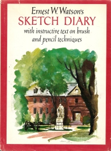
Mark-making. I’m going to stop now, resisting the additional of more fine line work detail. This doesn’t look as fine as a Ernest W. Watson pencil drawing, but it could if I was working on Bristol board and could literally cut and scrape back into the paper with a knife point and bring out white light highlights with a rubber eraser. Any eraser on this 80gm paper now would simply smudge what I’ve done. Watson says in his Sketch Diary (not in his other books) that paper quality is more important than pencil quality. If I’m going to persist with graphite pencil (and not all that many urban sketchers do), then I need to move to Bristol board. For the look that I’m aiming for, see my Tempietto Barbaro of Paladio from a couple of weeks ago – done on 200g multimedia heavy card.
Digression. I caught up with some of the vimeo videos done by Florian Afflerbach this week (see www.urbansketchers.org): pencil of cars and buildings, with very light colour wash added later. Highly recommended if you like (a) pencil drawing, or (b) are interested in drawing those mechanical life drawing poses otherwise known as motor cars.
Next steps:
- Go back to basics and draw the geometrical shapes with tone – as if it was a model made out of wooden cylinders and cones (add perspective lines);
- Review the floor plan for the elaborations (the added chapels)
- Tackle the front of the building in pencil;
- Tackle the interior (dome, squinches, etc.);
- try dots instead of lines when doing the light construction/foundation marks (the other way is to draw just vertical lines);
- Upgrade to Bristol board and aim for an Ernest W. Watson look in pencil;
- Try something in the looser style of Veronica Lawlor (pen) and Danielle McManus (colour);
- Try the sky background watercolour wash idea (200gm+ paper);
- Try drawing with grey watercolour pencil or grey fountain pen ink, with watercolour/gouache added.
Move to examining Sta Costanza (Rome), San Vitale (Ravenna) and others (that’s code for Really Simple Architecture), eventually tackling Hagia Sophia (photos) and local Sydney mosques (on location), as well as other Sydney buildings using domes (wooden domes at Hyde Park Barracks, copper domes at Observatory and QVB). The thing about mosques is that photographers tend to do closeups of the roof domes; ground-level ‘overall’ shots seem not to be as attractive.
Aiming also to sit inside the Sydney Town Hall next Tuesday lunchtime and sketch – a free organ recital (Veronica Lawlor’s Grand Central Station sketch is the inpiration for this one!).
Architecture for Urban Sketchers (3)
July 28, 2012
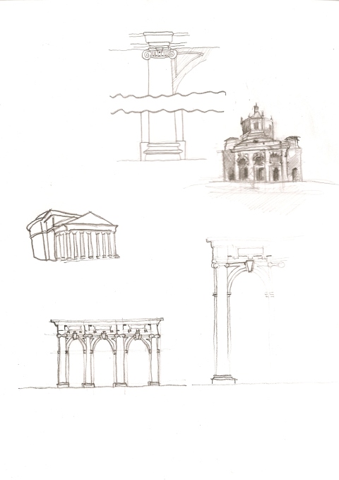
Some attention to the portico at the front entrance of the Chiesa San Lorenza in Milan, facing a small square built up on two sides and facing a row of Roman columns (the colonne di San Lorenzo). Most photographers and urban sketchers include these side buildings, if not the columns themselves. I’ve included a thumbnail of the portico tacked on to the front of the Panthenon as well.
Next stop is working up some sketches from photos, thanks to Google images. The thumbnail at top right is starting to show the dark shadows from the west (the viewer’s right) from the neighbouring buildings. The most impressive photos play on the shadows inside the portico and following the advice of Ernest W. Watson they will make the most interesting sketches.
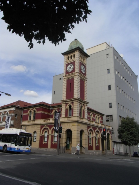
And what has all this cerebral analysis of Early Christian architecture got to do with contemporary urban sketching? Here’s a photo of a Sydney post office (Redfern NSW 2012) for comparison and consideration:
Architecture for Urban Sketchers (2)
July 28, 2012
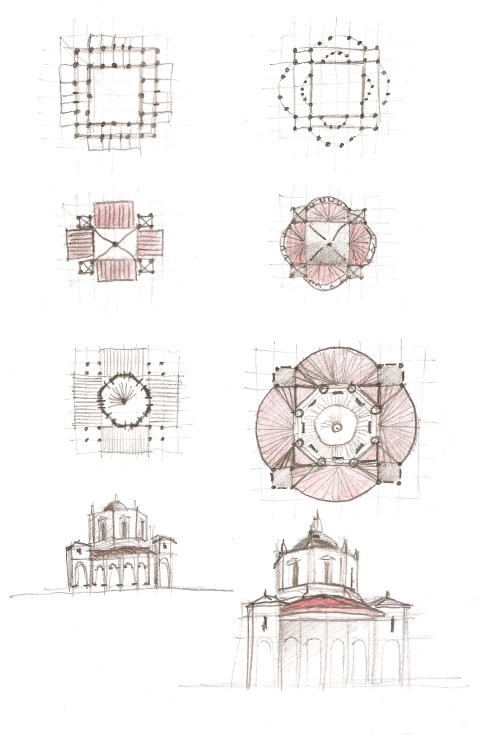
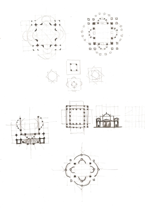
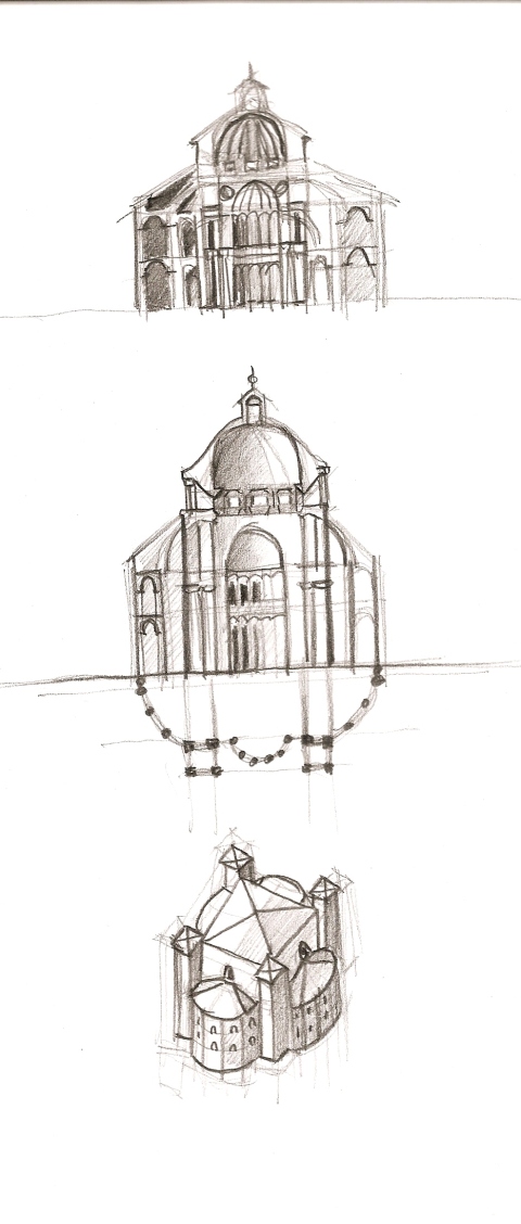
Here are more doodles based on the Chiesa San Lorenza in Milan. On the right I’ve started with the floor plan, minus the front portico and chapels, and progressed to working out how the roofs work following the protruding curves of columned walls. The third drawing down aims to understand how the Baroque octagonal dome drum fits (the church underwent fires and collapse and was extensively remodelled in the Baroque). The last is a drawing based on the photo in Copplestone’s World Architecture, again (rather self-consciously) ignoring the portico.
The 5th-century architect who thought up the tetraconches, the curves on all four sides, was truly inspired. What if a less inspiring architect stuck to two squares of straight walls? I’ve imagined this wholly less interesting scenario in the sketches on the left. Thus the roofs above them would have been oblong. Finally, the imposition of an octagonal shaped dome drum compounds the design problem visually.
I’ve gone with the idea of the four corners of the building being dominant towers. Anyone looking at the building today will be somewhat confused, because the towers are different heights, have been remodelled over the ages.
Once I finish with tackling the portico, I will move on to Sta Costanza in Rome and San Vitale in Ravenna both of which feature the double-shell or tetraconch design. This style seems to have come and gone quite quickly (4th to 6th centuries) but I feel myself being dragged inexorably towards Hagia Sofia. I passed the Gallipoli Mosque at Lidcombe in the train last week, so I guess that is all grist to this particular mill at this time.
References
http://www.learn.columbia.edu/ma/htm/kd/ma_kd_discuss_sanl.htm – Professor Dale Kinney’s excellent historical background and architectural analysis of this building. I particularly like the idea of the congregation being able to get closer to the action here compared to the basilica oblong-shape. I wonder how many contemporary Christians realise they have gone full circle: from being close to the action originally, to being cut off from the religious and the altar via a rood screen (certinly the religious had the wondrous light-filled area to the east in Notre-Dame-de-Paris all to themselves, leaving the congregation in the dark at the western end – this so annoyed one monarch that he had a walkway installed overhead so he could see what the religious were doing up and past the rood screen…) to contemporary churches where the priest officiates in the centre of the congregation.
Architecture for Urban Sketchers (1)
July 28, 2012
I took out my copy of The Art of Urban Sketching this morning to suss out where Buildings fitted into the scheme of things. It’s listed as the second preeminent category after Skylines, Cityscapes and Panoramas, so it’s pretty important. Interestingly, 2 hours kept coming up as the average time spent sketching a building.
If you’re an urban sketcher and not an architect like me, then you’ll be coping with arches and domes and columns every time you work on a building. Whether it’s a cathedral, church, art gallery or town hall, at least several of these elements will come into play. Even in non-Western architecture (Far East pavilions and Near East churches, mosques and synagogues), the same applies.
Where to start? The logical place is the Pantheon in Rome: a dome on a supporting circle. The problem for architects coming after was how to add to this, how to elaborate. Elaboration is difficult when you’ve got a dome on a cirle, but adding aisles and rooms and (apses and chapels in the case of Christian churches) is easy once the engineering problem of putting a dome on top of a square is overcome.
Enter stage right, the church of San Lorenzo in Milan. I’d never heard of it till recently, nor visited it when in Milan (apparently it’s a bit away from the central business district at Sant’Ambrogio), but here you’ve got one square inside another and a dome on top.
Don’t be mislead by the photos of it on Flickr. You’ve got to ignore several important elements:
* when looking at it front on, ignore the portico. Yes, it’s very imposing but its an add-on, an elaboration, which is not important to our understanding of the dome-and-square.
* ignore too the large piazza in front of it, with side buildings and a row of Roman columns (the colonne di San Lorenzo);
* ignore too the later chapels added on to the original church building.
So today’s doodles are about the square-within-a-square. The architect made it less of a fortress by creating curves of columns to balance any heaviness in the walls. Between the outer (strong) square, with its dominant corner “blocks” is the fan-shaped roof area on all four sides. The architect made an interesting foray into design by creating four columns in each curve, so from one perspective, it can look like a square superimposed on another square.
My subsequent next steps are as follows:
* examine the elaborate front portico, only because it’s so dominant for the urban sketcher looking up at the building;
* draw the front portico and facade wth this understanding of the structure underneath;
* draw the interior ( noting it is split into two parts: the upper dome with its tiny windows, and the lower dome shapes linked to the inner square of columns);
* move on to similar forms: domes-on-circles (Sta Costanza in Rome and Theodoric’s Tomb in Ravenna), domes-on-squares (SS. Sergius and Bacchus,Constantinople) and domes-0n-octagons (San Vitale, Ravenna). This will bring me up close and personal with squinches.
On Flickr and elsewhere, you will see some on-location sketches which show a less-than-perfect understanding of the building’s structure. But I sympathise because it’s easy to be seduced by the chapels added later. Speaking of which, once you get out of the square and the arcade of Roman columns, you can see the church a bit more clearly from the park behind. But unfortunately even here, the sketcher will get distracted by the fascinating bunch of chapels attached to the original building.
Background
Why a wonderful example of Early Christian Church architecture in Milan? Because Milan was the head of the Western Christian Church at this time, roughly 3rd century onwards. This church of St Lawrence (known as a basilica, even though it’s not in the strict rectangular basilica style) dates from the 5th-century. It’s a quatrefoil central-plan building (it stretches out four ways), with a double-shell layout (the square-within-a-square consising of an open central area surrounded by an ambulatory – a human parking area as well as useful for walking meditation by the religious). In drawing the interior, I must try and note the matroneum (a balcony for female worshippers) and try and imagine a polychrome interior decoration. I recommend sussing out descriptions of Early Christian church services to get a feeling of how busy the interior of this church would have been the 5th century.
Why is this building so important? It’s said to be the largest centrally-planned building in the Western World for its time. This central-planning aspect marks it out as one of the first Medieval buildings.
References
Campanario, The Art of Urban Sketching: drawing on location around the world.
Copplestone, ed. World Architecture.
On drawing buildings
July 27, 2012
No drawings of my own today. I’ve been out and about, with sketchbook and WalkStool always at the ready, but it’s been raining too much. I’ve been obsessed with Paladio, with the Early Christian Church (important examples in Milan, Rome and Aleppo), the Ancient Roman law court basilica becoming the Christian church form and the business of constructing domes on circles and on squares. And last night, glimpses of architecture in Palermo on television in Sicily Unpacked, following a documentary last week on Gothic cathedrals (Beauvais, Amiens, Rheims) and why their builders took risks reaching the heavens, resulting in their being unsafe structures nowadays.
I wanted to mention three books by Ernest W. Watson and some of the points he raises which I’m finding work for me. But more pressing is the latest post by http://scratchyas.wordpress.com on the difficult business of drawing buildings. My experience echoes hers and the examples of sketches she’s used of other peoples’ work all come from urban sketchers who constantly inspire and motivate me.
So here’s my eight burning issues and my fourteen bits of advice:
#1. Seeing buildings. To see them, to draw them (which means to really see them) is something you need to want to do. And want to do very much. Especially if you are not an architect. I could spend the rest of my life just walking around looking at buildings, but I’m a bit mad that way.
#2. You can run from them but you can’t hide. They are an important, if not highly significant, part of any urban sketcher’s repertoire. The Old Masters moved constantly between landscape, portraits, figure drawing and still life, so it follows naturally that urban sketchers will do the same and include buildings, either as stand-alone “portraits“ of individual buildings, or as the inevitable backdrop to street scapes. Sooner or later it dawns upon all urban sketchers, I’m sure, that they really have to tackle buildings seriously.
#3. What’s to improve? In writing music reviews, the word always at the tip of my tongue is “convincing“. Does it “convince“ the listener? Similarly, with a sketch or drawing, is it a self-conscious mess or is it a delightful mess, enchanting and convincing? As a former potter, I look at a potter’s work these days and ask, “Does it speak to me?“ (Gently please, but with presece and authority – the pot mustn’t “shout“ at me). Anyone, even a child, can come up with a representation of a house, but a “convincing“ building has a variety of marks, a variety of tonal values, interesting ‘pattern‘ and so on. If your building is looking “childish“, take out an eraser and knock back parts of it – rub them out or to a feint line. Mix it up and tackle it in another way.
#4. Photos and sketching on-site. Use photos as research: don’t turn up “cold“ to a building and expect to turn out a wonderful sketch. Consider buildings you might want to draw in the future, take photos when you pass by. Think about what time or day might be most suitable, what season might be suitable (those deciduous trees out the front will lose their leaves in Winter), look at Google Earth for the ‚strange‘ view from the middle of the street at about two metres or so above the ground (not your standard pavement view!), look at how others (amateurs and professionals) have photographed the building. I go a step further and investigate the building’s style so I can work out if I’ve already sketched a different building of similar vintage. I might not know the names of architectural features, but I can sure tell you which other buildings around town were built at the same time. Historical photos (especially in dramatic black-and-white with lots of shadow) will show you what it looked like before the greening of our cities. Keep going back: if Monet could paint haystakcs (and church facades) several times, then we all can. Don’t kid yourself you’ve conquered a building by sketching it once.
#5. Different drawing techniques. If you’re not happy with your results (and I don’t think anyone can master buildings without drawing lots of them), throw in a different technique or mix up your current palette of techniques. Drawing with the non-dominant hand, drawing just the negative space contours, continuous line – either blind or half-looking: moving between these will get you out of a rut and will be just as effective as changing from dry to wet media. Before you change your medium or your paper size, change your existing drawing technique. All my building sketches at the moment use a combination of techniques: negative space, blind contour, etc. The only thing I can’t do on location (but I can do it with a photo!) is turn the subject upside down. And it’s okay to turn the sketchbook around while you’re sketching – it’s not fixed like a canvas on an easel. Take note of scratchyas in her delightful treatment of the Chinese gardens: very convincing use of thick and thin lines, dark darks and areas of light. Excellent balance of fine detail and broad areas of space, a not overly-engineered sense of architecture and perspective, but enough accuracy in the perspective to render it realistic.
#6. Size of paper and ‘fitting it all in‘. I worry about this less as time goes by. Start on one of the four Golden Mean points and go for it! If I want to fit “everything in“ then I’m probably taking unncessary risks: I will definitely need a larger sketchbook, e.g. A4, but am I intending to spend one or two hours or more, repeated sessions perhaps on the one sketch to justify this size page? While there is no minimum size (one of my best sketches recently was done in under three minutes – the train I was due to catch was arriving at the train station! – and is barely an inch square), I normally stick to a 5×8“ sketchbook working across the double-page for a 30-40-60 minute drawing, knowing it will look “unfinished“ and there’ll be tons of white space around it. Almost without exception, wet media means you will fill the whole page or nearly all of it – that’s a whole different ballgame in terms of paper size. Ernest Watson’s urban sketches done in pencil invariably measure 8×11″ on 9×12” paper – only an architect would work on a piece of paper larger than A4.
#7. The disegno. I was brought up on the idea of the Renaissance study in chalk or bistre or sanguine (or three-pencils in the case of Watteau): an “unfinished“ main subject, with a close-up detail off to the side. Contemporary Urban Sketchers work MUCH more closely to the modern illustrationist model which falls out of book publishing and animation cells: filling the whole page, no “unfinished“ areas, something not unlike A Painting. The ideal in contemporary urban sketching is the 19th-century watercolour or lithograph. Urban sketchers are closer to J.M.W.Turner’s youthful street scenes than to life drawing sketches of the 15th-century.
#8. If it looks effortless… it probably is, but it conceals the sketcher’s years and years of painstaking efforts and constant practice. Architects move beyond their metier when urban sketching only because they have been “seeing“ (and imagining) buildings for ages and in ways that we non-architects cannot begin to fathom. Meegan mentioned shading (see my comments above about shadows, backing up Ernest Watson’s advice), composition – you have to think Golden Mean, patterns-of-threes and pay special attention to the Bottom Right Hand Corner of your sketch; variety of mark-making – only stick to one type of mark if you’re being deliberately minimal or “non-descript“ (e.g. line only, no tonal values) but otherwise use dots, dashes, squiggles; pattern – that balance between excitement and calm which relies on coherent repetition.
Advice:
- Position, position, position. Finding a good spot opposite Your Building is more difficult than you imagine. If you can’t sit, stand. If you can’t stand, take a photo and sketch it at home (!). It is vastly different to plein air in the countryside or by the sea. Some things we can’t fix – Sydney streets are too narrow, Melbourne streets are too wide. Cities rarely have public seating situated in terms of the perfect vista – and if you like the view, so probably do lots of others, especially at lunchtime! Suss out every possibility for viewing the building from inside or on top of another building; building security is very strict compared to times past, but consider above ground-floor shop windows, shop restaurants, anything! Most historical photos of buildings – before the days of cherrypickers – were taken from above the ground floor in a neighbouring building. Once ensconced, let the passing traffic pass by, including parked cars. Take heart that everything and everyone will eventually move out of your line of sight. In the worst case scenario, draw the parked car in your way (but the driver will probably turn up and drive off, just as you are finishing it).
- Bugbears. Urban sketchers hang around in groups in part I believe to foster solidarity in the face of urban hordes who are rushing from A to B and we are getting in their way. You need stamina, determination and grit to sketch buildings in modern-day cities. My biggest bugbear is a nearby smoker – that really puts me off my game. The second worst is drawing under a tree and a dog owner lets his or her dog relieve itself right near where I’m sitting: you are so part of the furniture and the dog is so keen to leave his mark… Patience, endless patience is required.
- Measuring. I notice Ernest Watson doesn’t measure with his pencil, as I do (half a pencil length here, a full pencil length there…). Watson instead recommends a 2“ square cut out of a piece of cardboard. You measure in 2“ lots around your building. I used to “just draw” – I still do, but some initial measuring really helps.
- Tackle panoramas, by all means, but lead the viewer in with some reference to the foreground. Otherwise you have a bottles-in-a-row look without any depth, literally without any depth of field – that’s not a sketch but more an historic document (where you might want to label the buildings, for examples).
- Slow down the hand. You are caressing those bricks and windowpanes; you are honouring the work of both the architect and builder by drawing them, so make the honouring process respectful. I get very excited when I start sketching a building I really like the look of. Being a typical male, I have to consciously slow down.
- Look for interesting shadow. This means drawing only or mostly on sunny days. If the day’s overcast, concentrate on flat pattern/detail rather than conveying mass or volume or depth or surface planes.
- Put the darks in very early. Once the darks are in, it’s easy to work through the greys.
- Sit rather than stand. People and animals, the passing parade, warrants standing up, but I’m increasingly finding that buildings (in any sort of detail) really do require sitting down. Because public seating is usually in the “wrong“ place, I take my own. A ‘portrait’ of a building, like the portrait of a person, needs time and respect. Bottom line: take a WalkStool or equivalent when out sketching buildings.
- Look for theatricality. Italian streetscapes are a “natural“ because they invariably look like theatre sets. Old English streets used to have that quality, but that’s disappearing. Contemporary urban planners like straight pavements, straight building alignments, 90-degree angles – which doesn’t make for naturally convincing sketches of buildings. Urban sketchers will of course maintain a varied diet: old buildings, new buildings, curvey buildings such as mosques, tall buildings such as skyscrapers, heavily-ornamented buildings such as cathedrals plus the most up-to-date of contemporary architecture (airports, museums, opera houses, especially).
- Don’t downplay the emotion. The sketch will inevitably carry or convey your emotional response to the building, as well as conveying the character of the building on behalf of the architect and builder. Yours is the last “layer“ or the last chapter in the story. Consider key – light or dark.
- Don’t disregard the air around the building. Asian urban sketchers convey this in large part because their cities are so incredibly busy and noisy. The “air“ enveloping buildings invariably shows up in watercolour sprays and dots or quietly panicked scribbly line – we “feel“ the exhausting humidity, the oppressive pollution and the milling throngs of people, even if we’ve never set foot in that city.
- Don’t overcomplicate things. If you’re thinking shadows and pattern, you might not get so distracted by the trees or gardens or streetscape: if you put everything in, in the same amount of detail, the whole thing will collapse under its own weight. Practice and personal temperament will affect how many ‚extras“ you add to a portrait of a building.
- Buildings as Boxes-with-Ornaments. The issue of ornament is a vexed problem for all architects. For urban sketchers, it’s a problem too with a building ending up looking like a box or the whole thing weighed down by too much detail. Suggest detail (see Ernest Watson on how draw inside shadows).
- Situate the Building. Just as you would suggest or allude to the poser’s surroundings in life drawing (suggesting a floor, table, architrave), find some excuse to “ground“ the building – an horizon line, real or imagined, a tree/vegetation to suggest or convey depth of field.
More on Ernest W. Watson later, but in the meantime, check out the Urban Sketchers website, Urban Sketchers Australia and www.lizsteel.com (especially her Sketching Architecture weblog)! I look forward to more sketches and commentary from scratchyas as well.
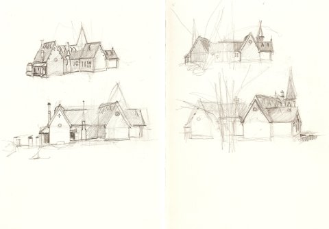
Double-page spread, 5×8″ sketchbook.
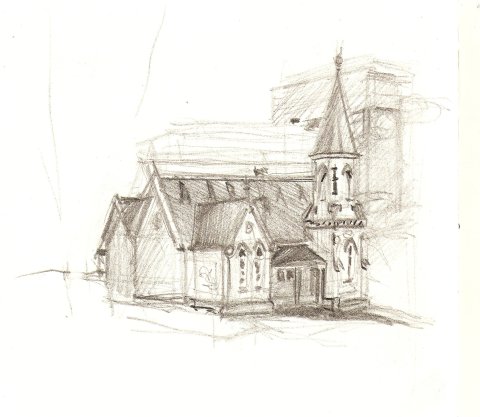
Approx. 3×4″
Getting a handle on simple building structures – conveying three-dimensional space of a bunch of ‘shoeboxes’ – is made difficult by the presence of trees and other buildings. An exception to this is the Old Darlington School on the grounds of Sydney University. It is almost unique in being able to be seen from all directions, both up close and also at some distance. Notwithstanding the presence of large trees, which I’ve tried to ignore, I spent time doing several thumbnail sketches today, late in the afternoon around sunset, 3-4pm. It was overcast and the lack of sun wasn’t a concern since I wasn’t trying to convey tone. Thanks to comfortable semi-circular, continuous seating in the park setting for this School, there is potential for sketching the same building, at the same size, at the same distance: great perspective practice!
My aim was to try to get the perspective down convincingly and to minimise detail. The building is in such immaculate condition that the contrast between barge boards and slate rooves and cleaned brick walls is very clear. What is unusual and challenging is the fact that the gables are so very steep. As one moves from north to south around the park, the south facade spire comes into view. What makes this set of buildings interesting is that the chimneys and spire are inset into the slate roof.
By the time of the last sketch, I was getting a handle on the building and couldn’t resist finishing with some attention to the detail; the brick and timber detailing on the south facade are particularly attractive. And I didn’t even have time today to take in the marvellous east facade!
The idea of thumbnails from a variety of angles (apart from getting perspective right) comes from Ernest W.Watson’s comments about size and composition (how large should a sketch be?), size and tone (a range of values which expands the closer you get to the subject) and size and detail (further away, less detail). Watson provides an example: six differently-sized sketches of a boathouse on the Cornish coast, showing how the tonal range increases and the amount of detail similarly increases, the closer you get to the building.
Background
It was designed c.1877 by George Allen Mansfield, architect to the Education Department and is a fine example of the single-storey Gothic Revival style suburban schools of the period. It was transferred to the University in 1975. Photos on the Sydney Architecture website appear to date from renovations undertaken in 1978.
Old Darlington School is two-storeys, constructed of polychromatic brickwork, with sandstone sills, kneelers, broachers and string courses. The spire is in the SW corner; note the chimney almost in the centre of the verandah on the west facade. Blond brick is used for the body of the walls; see the use of red brick to accentuate window arches and the quatrefoil window to the main gable. They have been used recessed to form a cross motif, based on brick modules – see the spire and the sill to the main gable. Outbuildings have been removed.
References
Ernest W. Watson, The Art of Pencil Drawing. New York, Watson-Guptill, 1985
